M Energy return on investment
A chapter added in the 2026 revision. Chapter 3 asks a question and then declines to answer it properly:
What about the energy-cost of producing the car’s fuel?
Good point. When I estimate the energy consumed by a particular activity, I tend to choose a fairly tight “boundary” around the activity. […] It’s been estimated that making each unit of petrol requires an input of 1.4 units of oil and other primary fuels.
That is the honest admission of a book built on tight boundaries, and it points at a whole literature. This chapter is that literature’s technical partner, in the same way that chapter A partners chapter 3 and chapter C partners chapter 5. It turns out that MacKay’s instinct — that the boundary is where the difficulty lives — is exactly right, and that the field spent two decades discovering it.
The measure
Energy return on investment is the ratio of energy delivered to energy spent getting it:
\[ \text{EROI} = \frac{\text{energy delivered}}{\text{energy required to deliver it}} \]
Below 1 the thing is not an energy source at all. The concept was made quantitative by Charles Hall in the 1970s and reached a wide audience through a paper in Science in 1984.
The attraction is obvious. A society does not run on the energy it extracts; it runs on what is left after extraction has taken its cut. MacKay’s stacks count gross energy at a tight boundary, and EROI is the correction that boundary omits.
The difficulty is that published EROI values for the same fuel differ by more than an order of magnitude, and the differences are mostly not measurement error. They are boundary choices, of two distinct kinds.
The first boundary: where the fuel gets used
Most quoted EROI figures are measured at the point of extraction — at the wellhead or the pithead. But nobody burns crude oil. Between the wellhead and the tank sit transmission, refining and distribution, each of which costs energy, and the fuel that finally does work is a fraction of what came out of the ground.
Hall, Balogh and Murphy put numbers on that for American oil, and their cascade is the clearest picture in this literature of what a boundary actually does.
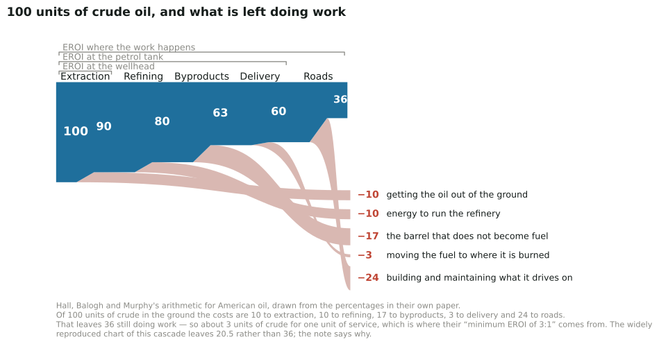
Figure M.1. Added in the 2026 revision. What a hundred units of crude oil are worth by the time a car moves, computed from Hall, Balogh and Murphy’s own percentages. Each brace is one of the boundaries this chapter is about.1
Read the brackets rather than the bars. The paper’s starting point is American oil returning about ten units at the wellhead for every one spent getting it out. Move the line to the petrol tank and forty of the hundred units are gone — ten to extraction, ten to running the refinery, seventeen to the part of the barrel that never becomes motor fuel, three to moving it — and the ratio is scaled down by that same forty per cent, to six. Move it to where the service actually happens, add the twenty-four units that build and maintain the roads, and sixty-four per cent of the barrel has been spent: the ratio falls to about three and a half.
Note that this scaling is not the same operation as reading the ratio off the picture. The thirty-six units left at the end say that delivering one unit of service takes roughly three units of crude — 100 divided by 36 — and that is the sentence the paper is known for: the minimum EROI is about 3:1. The two arrive at almost the same number here, which is lucky rather than necessary, and this edition says which is which because the difference between them is exactly the kind of thing this chapter is about.
Nothing about the oil changed between those three answers. Only the question did.
Murphy, Raugei, Carbajales-Dale and Rubio Estrada argue that this makes almost every published comparison invalid, and they demonstrate why with three hypothetical resources:2
| Resource | EROI at point of extraction | EROI at point of use |
|---|---|---|
| PES1 | 100 | 10 |
| PES2 | 50 | 9.1 |
| PES3 | 25 | 7.7 |
A resource that looks four times better than another at the wellhead is 30% better at the tank. Once the downstream stages dominate, the headline number stops carrying information. This is precisely MacKay’s query, stated as a general result: the energy cost of producing the fuel is not a small correction, it is most of the answer.
The second boundary: what scale you measure at
Michael Carbajales-Dale identified a different trap, and it is not widely understood.3 Two quantities are routinely both called EROI. The first is a facility ratio: energy a plant delivers over its life, divided by the energy to build and run it. The second is an industry ratio: energy delivered by a sector this year, divided by energy invested in that sector this year. He proposes calling the second power return on investment, PROI.
His example should be read twice. In 2018 onshore wind had a facility-scale EROI of over 70. The same technology as a growing global industry had a PROI of about 25. Nothing about the turbines differed. The ratio was depressed purely because the industry was expanding, so much of that year’s investment sat in machines not yet generating. The two converge only as growth approaches zero.
The consequence is uncomfortable for anyone quoting these numbers in an argument. Industry-scale net-energy accounting penalises fast-growing sectors and flatters stagnant ones.
Harmonised values
With both corrections applied — everything measured at point of use, on a common method — the ordering is not the one the older literature reports.
| Fuel or source | EROI at point of use |
|---|---|
| Photovoltaics, wind, hydropower | at or above 10 |
| Hard coal | 8.8 |
| Natural gas | ~5.6 or below |
| Petroleum oil (median) | 4.2 |
| Biodiesel, bioethanol, oil-sands petrol | below 5 |
| Wood pellets | 1.6 |
Two entries deserve a note. Locally-sourced woodchips come out at 32, but only because that particular supply chain is short and simple; wood pellets, which need drying and pressing, manage 1.6, and the authors warn against reading the first as representative of biomass generally. And maize bioethanol reaches at best 1.6 — a fuel that barely returns the energy put into it.
The headline result is that oil is below ten and renewable electricity is above it. That reverses the comparison the peak-oil literature was built on, and it does so not by discovering anything new about turbines but by measuring oil where it is actually used rather than where it comes out of the ground.
The authors note the associated rule of thumb, the net energy cliff: at an EROI of 10, 90% of the delivered energy is net. Below that the fraction falls away sharply, which is why the region between about 10 and 1 matters so much more than the difference between 50 and 100.
What storage does to the answer
Renewables are variable, so a fair comparison should include the storage or overbuild that makes them dispatchable. Graham Palmer set out a framework for this, building on energy stored on invested — the electricity a storage device handles over its life against the energy embodied in building it — and computing a system ratio whose denominator carries both generators and storage.4
His finding is a shape rather than a number, and it is the important one: storage and overbuild show marked diminishing returns as the share of variable generation rises. The first units of storage buy a great deal of usable energy; later units buy less, because they cycle less often. So “what is the EROI of wind?” has no single answer even in principle. It depends on how much wind is already there.
Societal EROI, and the threshold argument
The most consequential claim in this literature is that a society needs a minimum EROI to function. Hall and colleagues put the floor for a fuel at about 3:1 in 2009, and the figure has been repeated ever since.
It can now be checked against an estimate of the thing itself. Dupont, Germain and Jeanmart modelled the world economy as two sectors — energy, and everything else — and obtained for 2018 a gross societal EROI of 9.4 and a net of 8.5; an earlier estimate put 2015 at 12.5 Set those against the thresholds on offer:
| Threshold proposed | Value | For what |
|---|---|---|
| Hall et al. (2009) | ~3 | bare minimum for a fuel |
| MEDEAS model | ~5 | below this the energy sector’s capital needs overwhelm the economy |
| Court and Fizaine (2016) | 11 | to maintain economic growth |
| Observed in high-HDI countries | above 20 | associated with high human development |
The world’s estimated societal EROI, 8.5 to 12, sits above the first two and below the last two. So “are we near the minimum?” has no answer until one says which minimum, and the candidates span the estimate. Court’s own reconstruction has the minimum sustainable societal EROI itself falling — from just over 20 in 1900 to around 6 since the 1970s — because an economy that has built its infrastructure needs less surplus to maintain it than one building it. A threshold that moves with the thing it measures is not much of a threshold.
What survives is a number worth more than any of them. Only 39% of the final energy the world produces reaches consumption and growth at all. The other 61% is consumed inside the economy that produces it — 11% by the energy sector, and fully 50% by the rest of the economy as intermediate and capital consumption. The authors report this split is insensitive to their model’s assumptions.
That is the real content of the net-energy argument, and it needs no threshold to be right. When this book adds up 125 kWh per day per person, the share reaching anything a person would recognise as a benefit is a good deal smaller than the total suggests.
Back to the car
MacKay’s figure can now be placed. Treloar’s estimate that each unit of petrol requires 1.4 units of oil and other primary fuels is a well-to-tank ratio, and the harmonised work above puts petrol’s point-of-use EROI at about 4.2 — meaning roughly a quarter of the energy mobilised to deliver a litre of petrol is spent delivering it.
So the 40 kWh per day in chapter 3 understates the primary energy behind the driving substantially. And the correction does not apply equally to the electric replacement, whose chain runs through generation rather than refining, and whose upstream sources — wind, PV, hydro — sit above 10 on the same harmonised basis where oil sits at 4.2.
Chapter 15 found the electric car about twice as good as the petrol one once manufacturing was counted. On a point-of-use net-energy basis the gap is wider than that, and for a reason MacKay’s method could not see: not because the electric car is better engineered, but because the fuel it does not burn is expensive to make.
The same disease in a different metric: levelised cost
Added in the 2026 revision. Everything above is about energy accounting. There is a money metric with the same structure and, it turns out, the same disease. Levelised cost of energy is the discounted lifetime cost of a plant divided by its discounted lifetime output, and it is the number that decides policy: it is what gets quoted when someone says solar is now the cheapest electricity in history. Chapter 28a uses it.
A 2025 review in Energy Research & Social Science takes the formula apart, and its diagnosis is the one this chapter has been making. The formula is “deceptively simple” — simple enough that the caveats disappear into it, and the caveats are where the answer lives. Four boundary choices do most of the work.6
The first is asset or system. An asset-level LCOE counts what happens inside the fence: capital, fuel, operations, output. It excludes the balancing and backup capacity that a variable source needs, the curtailment it suffers when the grid cannot take its output, and — this is the one usually missed — the capacity utilisation it takes away from the dispatchable plant that has to stay available for it. Those are real costs incurred by the system on the variable source’s account. The review’s first requirement is blunt: decide whether you are computing an asset metric or a system metric, and if it is an asset metric, do not compare technologies with it. It then observes that not one of the reputable organisations it surveys resists that temptation.
The second is using one discount rate and one lifespan for everything. The convention is to use a common discount rate across technologies and a horizon set by the shortest-lived asset in the comparison. Both choices have a direction. Truncating the horizon charges a long-lived asset its whole capital cost while counting only part of its output, so the convention systematically favours short-lived assets over long-lived ones — wind and solar over nuclear and hydro, on an assumption most readers of the resulting table would not know had been made. And a single discount rate ignores that different technologies are funded by different investors at genuinely different costs of capital.
The third is nameplate against maximum practical capacity. Capacity that cannot actually be used has no economic value, but it sits in the denominator lowering the cost per megawatt-hour.
The fourth is residual costs. What happens after the horizon ends — decommissioning, replacement, the long tail — falls outside the sum.
The paper works a case: Bessakerfjellet, a 57.5 MW onshore wind farm in Norway, costed on IEA figures, with gas balancing because gas is what actually balances renewables in 26 OECD countries. Committing the farm to firm delivery and minimising total cost turns out to mean committing only 45% of installed capacity — which, as the author puts it, effectively turns a 57.5 MW installation into a 25.9 MW one. On that basis the levelised cost comes out 19% above the asset figure deterministically, 34% above once the uncertainties are carried through a Monte Carlo, and — if the model is instead run at nameplate capacity — the system cost reaches up to 3.5 times the asset LCOE.
His conclusion is that no organisation he surveyed publishes an LCOE that is true to the total cost of an energy source, and — importantly — that the metric should be repaired rather than abandoned, because a system LCOE is computable without becoming impossibly technical.
Now the part this chapter is obliged to add. The author has a stated position: he has published several papers arguing that wind balanced by fossil generation is not sustainable, and this review is continuous with that work. That does not make the structural critique wrong — the distinction between asset and system cost is mainstream, and the point that a common discount rate and a truncated horizon are not neutral choices is simply true. But the 3.5 figure is his own case study with his own boundary, and that boundary is a strong one: it charges a single wind farm the full cost of firming itself to a dispatchable standard with dedicated gas, where a system operator balances across a whole fleet and a whole market and never firms one asset in isolation.
Which is exactly the point. A critique of a boundary-dependent metric is itself boundary-dependent. The lesson is not that wind costs 3.5 times what IRENA says; it is that both the low number and the high one are answers to questions that have not been stated.
The consequence for this edition is worked out where it belongs, in chapter 28a. That chapter’s central figure sets levelised costs against the price each technology’s output actually realised on the market — and a capture price is a system quantity while a levelised cost is an asset quantity, so the two sides of that comparison sit on different boundaries. Which side that flatters, and by how much, is a question for the chapter that draws the chart. It is asked there.
Where the numbers come from, and how far they spread
Added in the 2026 revision. Everything above turns on a small number of single figures — an EROI of 4.2 for oil, of 8.8 for hard coal, of 10 or more for photovoltaics. Each is the centre of a distribution, and the distributions are wide. The same is true of nearly every techno-economic number quoted anywhere in this book: the levelised costs in chapter 28a, the power densities in chapter 18’s table, the capacity factors in chapter 10.
The scale of that spread has recently become measurable. Gorres and colleagues applied automated extraction to 76 000 energy system studies published since 2010, pulling out 3.2 million structured quantitative data points and 20 million metadata entries into a searchable database, with the explicit aim of showing where the assumptions used in models diverge from what has been observed.7
Their framing is the one this chapter has been arguing from: “Energy system models guide societally important decisions, but their credibility rests on quantitative assumptions that are difficult to source and audit.” That is exactly the problem harmonisation solves for EROI, and it is worth stating that the same problem applies to every other number here.
A reader who wants to know how firm any figure in this edition is should assume it sits in a range, and that the range is often wider than the difference between the technologies being compared. That is not a reason to abandon the arithmetic. It is a reason to prefer conclusions that survive the whole range — which is why this chapter’s finding is stated as renewable electricity is above the thermal fuels at point of use, and not as a league table of decimal places.
Notes and further reading
Charles A. S. Hall, Stephen Balogh and David J. R. Murphy, “What is the Minimum EROI that a Sustainable Society Must Have?”, Energies 2(1):25–47, 2009, sections 5.1 and 5.2, which is open access. The five percentages are theirs: ten per cent for extraction, ten to run the refinery, seventeen as non-fuel loss, about three for delivery — which they sum themselves as “about 40 percent … less than the EROI at the mine mouth” — and a further twenty-four for the infrastructure the fuel is used on, giving “64 percent of the initial oil in the ground”. The data task fails if those two sums stop coming to 40 and 64, or if the remainder stops implying the paper’s own “roughly 3 units of crude oil” per unit of service. Two cautions about reading the figure. The seventeen units of non-fuel loss are not energy destroyed: they are asphalt, lubricants and petrochemical feedstock, which are useful, and they count as loss only because the question being asked is about motor fuel. And the twenty-four units for roads are an estimate derived from national ratios of money to energy rather than measured, which the authors say plainly; it is the softest number here and the one a sceptical reader should push on first. A note on the drawing. This cascade is widely reproduced as figure 1 of Hall, Lambert and Balogh, “EROI of different fuels and the implications for society”, Energy Policy 64:141–152, 2014, where the road charge is 37.5 units and 20.5 are left rather than 36. This edition could not reconcile that with the 2009 paper the chart cites: 37.5 is 64.7% of the 58 units remaining after the first three steps, which is the 2009 paper’s 64% total applied a second time to a flow already net of the first 42%. Taking the chart’s figures at face value would give about five units of crude per unit of service, not the three the same authors state in words. So this edition has drawn the cascade from the 2009 percentages, and the task checks the arithmetic against the conclusion the paper draws from it. This is not offered as a correction to anyone — it is offered because a chapter about boundaries ought to say when it could not make two published versions of the same boundary agree.↩︎
David J. Murphy, Marco Raugei, Michael Carbajales-Dale and Brenda Rubio Estrada, “Energy Return on Investment of Major Energy Carriers: Review and Harmonization”, Sustainability 14 (2022) 7098, https://doi.org/10.3390/su14127098. Point-of-use harmonisation using Ecoinvent life-cycle inventories; petrol taken as the representative oil product. Median harmonised EROI for oil 4.2, hard coal 8.8, wood pellets 1.6 maximum, locally-sourced woodchips 32; PV, wind and hydropower at or above 10. The maximum point-of-use EROIs by supply-chain stage in their Table 2 give oil 8.7, gas 5.6 and coal 10 before extraction costs are counted, which is why the medians above are lower.↩︎
Michael Carbajales-Dale, “When is EROI Not EROI?”, BioPhysical Economics and Resource Quality 4:16 (2019), https://doi.org/10.1007/s41247-019-0065-8, responding to Brockway et al. (2019) on the incomparability of wellhead-oil and renewable-electricity ratios. Regional PROI approaches facility EROI only as the industry growth rate approaches zero.↩︎
Graham Palmer, “A Framework for Incorporating EROI into Electrical Storage”, BioPhysical Economics and Resource Quality 2:6 (2017), https://doi.org/10.1007/s41247-017-0022-3, modelled on the Texas ERCOT system. The energy-stored-on-invested metric is from Barnhart and Benson (2013).↩︎
Elise Dupont, Marc Germain and Hervé Jeanmart, “Estimate of the Societal Energy Return on Investment (EROI)”, Biophysical Economics and Sustainability 6:2 (2021), https://doi.org/10.1007/s41247-021-00084-9. Gross societal EROI 9.4 and net 8.5 for 2018 worldwide; 39% of final energy reaching consumption and growth, 11% consumed by the energy sector and 50% within the rest of the economy. The threshold figures are as surveyed there: Hall et al. (2009), the MEDEAS model of Capellán-Pérez et al., Court and Fizaine (2016), Court (2019) on the historical decline, and the association of societal EROI above 20 with an HDI above 0.75.↩︎
Jan Emblemsvåg, “Rethinking the ‘Levelized Cost of Energy’: A critical review and evaluation of the concept”, Energy Research & Social Science 119 (2025) 103897, https://doi.org/10.1016/j.erss.2024.103897. The six requirements for a reconceptualised LCOE are the paper’s section 5: asset-or-system choice with no cross-technology comparison at asset level; system stability made explicit through reliability-availability-maintainability calculations or explicit balancing capacity; the consequences of dispatch priority modelled and assigned by the cost-causation principle; a capacity model based on maximum practical rather than nameplate capacity, at hourly resolution or better; lifespan and discounting attuned to the investor types that actually fund each technology, with a project- or technology-specific WACC in nominal terms and residual costs computed; and value adjustments used only where they are the best available model of system alternative cost. The Bessakerfjellet case is section 6.3: 57.5 MW, 25-year life following IRENA, 7% nominal WACC, IEA cost data, 2.5% inflation modelled as a triangular distribution, gas as the balancing and backup source. Deterministic system LCOE 36.6 USD/MWh at a 45% capacity commitment (19% above asset LCOE), 53.8 USD/MWh with uncertainties (34% above the deterministic asset figure), and at nameplate capacity 39.9 deterministic, 47.9 with uncertainties, with the system LCOE reaching a maximum of 3.5 times the asset LCOE.
Two cautions belong with this, and the second is the more important. First, the author has a consistent published position — including “Wind energy is not sustainable when balanced by fossil energy” (2021) and work on permanent-magnet wind power (2025) — and this review is continuous with it. The structural critique is nevertheless mainstream: the asset-versus-system distinction and the concept of a system LCOE are established in the literature independently of him. Second, the case study firms a single wind farm to a dispatchable standard using dedicated gas, and assigns the whole cost of doing so to the wind. Real systems balance across a fleet, so this is an upper bound on the firming cost attributable to any one asset rather than an estimate of it. Both the asset LCOE the paper criticises and the system LCOE it computes are boundary choices, which is this chapter’s subject rather than an objection to the paper.↩︎
Maxime Gorres, Jan Göpfert, Patrick Kuckertz, Noor Titan Putri Hartono, Heidi Heinrichs, Jochen Linßen, Iain Staffell and Jann Michael Weinand, “Automated Extraction of Techno-Economic Data from 76,000 Energy System Studies”, arXiv:2607.19178, July 2026: https://arxiv.org/abs/2607.19178. The database is FAIR-compliant and published with an interactive dashboard. Two cautions on using it. Automated extraction from text inherits the errors of the papers it reads and adds its own — a figure pulled from a table without its footnote may lose the boundary conditions that make it meaningful, which is precisely the failure this chapter is about. And a distribution of published values measures what researchers have assumed, not what is true; a widely repeated number can be widely wrong. It is a map of the literature, which is a different thing from a map of the world, and useful for exactly that reason.↩︎