1 Motivations
We live at a time when emotions and feelings count more than truth, and there is a vast ignorance of science.
James Lovelock
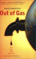
David Goodstein’s Out of Gas (2004).
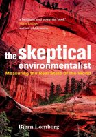
Bjørn Lomborg’s The Skeptical Environmentalist (2001).

The Revenge of Gaia: Why the earth is fighting back – and how we can still save humanity. James Lovelock (2006). © Allen Lane.
I recently read two books, one by a physicist, and one by an economist. In Out of Gas, Caltech physicist David Goodstein describes an impending energy crisis brought on by The End of the Age of Oil. This crisis is coming soon, he predicts: the crisis will bite, not when the last drop of oil is extracted, but when oil extraction can’t meet demand – perhaps as soon as 2015 or 2025. Moreover, even if we magically switched all our energy guzzling to nuclear power right away, Goodstein says, the oil crisis would simply be replaced by a nuclear crisis in just twenty years or so, as uranium reserves also became depleted.
In The Skeptical Environmentalist, Bjørn Lomborg paints a completely different picture. “Everything is fine.” Indeed, “everything is getting better.” Furthermore, “we are not headed for a major energy crisis,” and “there is plenty of energy.”
How could two smart people come to such different conclusions? I had to get to the bottom of this.
Energy made it into the British news in 2006. Kindled by tidings of great climate change and a tripling in the price of natural gas in just six years, the flames of debate are raging. How should Britain handle its energy needs? And how should the world?
“Wind or nuclear?”, for example. Greater polarization of views among smart people is hard to imagine. During a discussion of the proposed expansion of nuclear power, Michael Meacher, former environment minister, said “if we’re going to cut greenhouse gases by 60% … by 2050 there is no other possible way of doing that except through renewables;” Sir Bernard Ingham, former civil servant, speaking in favour of nuclear expansion, said “anybody who is relying upon renewables to fill the [energy] gap is living in an utter dream world and is, in my view, an enemy of the people.” 1 *
* Every chapter has endnotes giving references, sources, and details of arguments. Their presence will be indicated in this way. The [1] here links to the relevant end-note. The [1] in the end-notes will return here.
Similar disagreement can be heard within the ecological movement. All agree that something must be done urgently, but what? Jonathon Porritt 2, chair of the Sustainable Development Commission, writes: “there is no justification for bringing forward plans for a new nuclear power programme at this time, and … any such proposal would be incompatible with [the Government’s] sustainable development strategy;” and “a nonnuclear strategy could and should be sufficient to deliver all the carbon savings we shall need up to 2050 and beyond, and to ensure secure access to reliable sources of energy.” In contrast, environmentalist James Lovelock writes in his book, The Revenge of Gaia: “Now is much too late to establish sustainable development.” In his view, power from nuclear fission, while not recommended as the long-term panacea for our ailing planet, is “the only effective medicine we have now.” Onshore wind turbines are “merely … a gesture to prove [our leaders’] environmental credentials.”
This heated debate is fundamentally about numbers. How much energy could each source deliver, at what economic and social cost, and with what risks? But actual numbers are rarely mentioned. In public debates, people just say “Nuclear is a money pit” or “We have a huge amount of wave and wind.” 3 The trouble with this sort of language is that it’s not sufficient to know that something is huge: we need to know how the one “huge” compares with another “huge,” namely our huge energy consumption. To make this comparison, we need numbers, not adjectives.
Where numbers are used, their meaning is often obfuscated by enormousness. Numbers are chosen to impress, to score points in arguments, rather than to inform. “Los Angeles residents drive 142 million miles – the distance from Earth to Mars – every single day. 4” “Each year, 27 million acres of tropical rainforest are destroyed.” “14 billion pounds of trash are dumped into the sea every year.” “British people throw away 2.6 billion slices of bread per year.” “The waste paper buried each year in the UK could fill 103448 double-decker buses.”
If all the ineffective ideas for solving the energy crisis were laid end to end, they would reach to the moon and back…. I digress.
The result of this lack of meaningful numbers and facts? We are inundated with a flood of crazy innumerate codswallop. The BBC doles out advice on how we can do our bit to save the planet – for example “switch off your mobile phone charger when it’s not in use;” if anyone objects that mobile phone chargers are not actually our number one form of energy consumption, the mantra “every little helps” is wheeled out. Every little helps? A more realistic mantra is:
if everyone does a little, we’ll achieve only a little.
For the benefit of readers who speak American, rather than English, the translation of “every little helps” into American is “every little bit helps.”
Companies also contribute to the daily codswallop as they tell us how wonderful they are, or how they can help us “do our bit.” BP’s website, for example, celebrates the reductions in carbon dioxide (CO2) pollution they hope to achieve by changing the paint used for painting BP’s ships. Does anyone fall for this? Surely everyone will guess that it’s not the exterior paint job, it’s the stuff inside the tanker that deserves attention, if society’s CO2 emissions are to be significantly cut? BP also created a web-based carbon absolution service, “targetneutral.com,” 5 which claims that they can “neutralize” all your carbon emissions, and that it “doesn’t cost the earth” – indeed, that your CO2 pollution can be cleaned up for just £40 per year. How can this add up? – if the true cost of fixing climate change were £40 per person then the government could fix it with the loose change in the Chancellor’s pocket!
Even more reprehensible are companies that exploit the current concern for the environment by offering “water-powered batteries,” “biodegradable mobile phones,” “portable arm-mounted wind-turbines,” and other pointless tat.
Campaigners also mislead. People who want to promote renewables over nuclear, for example, say “offshore wind power could power all UK homes;” 6 then they say “new nuclear power stations will do little to tackle climate change” because 10 new nuclear stations would “reduce emissions only by about 4%.” This argument is misleading because the playing field is switched half-way through, from the “number of homes powered” to “reduction of emissions.” The truth is that the amount of electrical power generated by the wonderful windmills that “could power all UK homes” is exactly the same as the amount that would be generated by the 10 nuclear power stations! “Powering all UK homes” accounts for just 4% of UK emissions.
Perhaps the worst offenders in the kingdom of codswallop are the people who really should know better – the media publishers who promote the codswallop – for example, New Scientist with their article about the “water-powered car.” 7
In a climate where people don’t understand the numbers, newspapers, campaigners, companies, and politicians can get away with murder.
We need simple numbers, and we need the numbers to be comprehensible, comparable, and memorable.
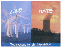
Figure 1.1. This Greenpeace leaflet arrived with my junk mail in May 2006. Do beloved windmills have the capacity to displace hated cooling towers?
With numbers in place, we will be better placed to answer questions such as these:
- Can a country like Britain conceivably live on its own renewable energy sources?
- If everyone turns their thermostats one degree closer to the outside temperature, drives a smaller car, and switches off phone chargers when not in use, will an energy crisis be averted?
- Should the tax on transportation fuels be significantly increased? Should speed-limits on roads be halved?
- Is someone who advocates windmills over nuclear power stations “an enemy of the people”?
- If climate change is “a greater threat than terrorism,” 8 should governments criminalize “the glorification of travel” 9 and pass laws against “advocating acts of consumption”?
- Will a switch to “advanced technologies” allow us to eliminate carbon dioxide pollution without changing our lifestyle?
- Should people be encouraged to eat more vegetarian food?
- Is the population of the earth six times too big?
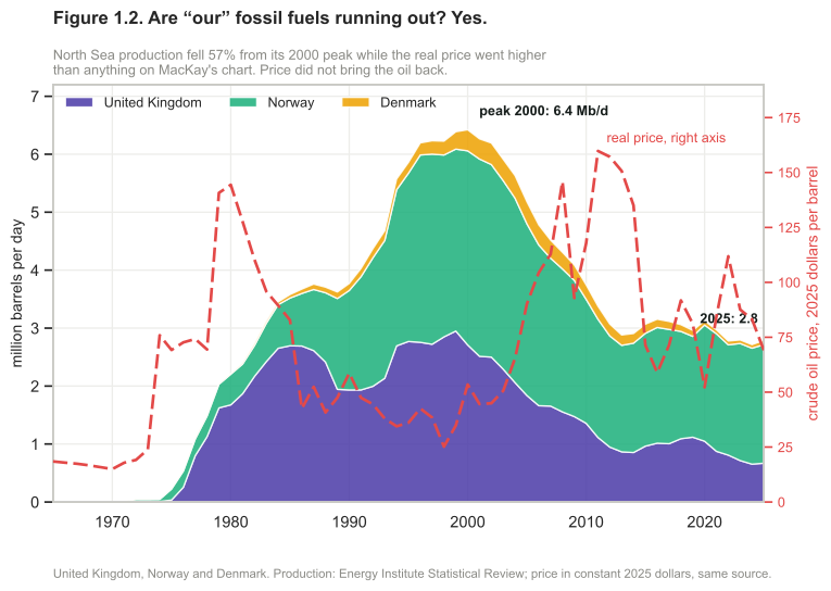
Figure 1.2. Added in the 2026 revision, replacing MacKay’s own version. His ended in 2007, just as the decline began and the price was climbing. Twenty-five years of the same two series answer his question. North Sea production peaked in 2000 at 6.4 million barrels a day and was 2.8 in 2025, a fall of 57%; Britain’s own share fell from 2.95 million barrels a day in 1999 to 0.67, down 77%. Meanwhile the real price went to $160 a barrel in 2025 money, far above anything on his chart, and the decline did not pause. The oil did not come back when it became valuable, which is chapter N’s argument arriving in the first chapter: the peak was a geological fact that a price could not reverse.10
Production is what MacKay’s figure plotted, but production is not what a country has to sell. What it has to sell is production minus what it burns itself, and on that measure the three countries stop being one story at three scales.
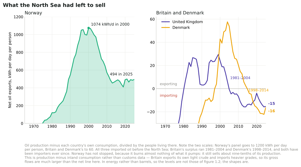
Figure 1.2a. Added in the 2026 revision. The same three countries as exporters rather than producers: what was left after each had supplied itself, per person per day. Note that the two panels are drawn to scales twenty times apart.11
Britain’s North Sea surplus lasted twenty-four years. It began in 1981, peaked in 1999 at 29 kWh per day per person, and ended in 2004; every year since has been a deficit, and in 2025 Britain imported a net 15 kWh/d per person — more energy in oil than it produced. Denmark’s surplus lasted seventeen years, 1998 to 2014, and it now imports 16. Norway’s is in its fifty-first year and has never been interrupted: it peaked at 1074 kWh per day per person in 2000 — about eight and a half times the 125 kWh/d MacKay gives in chapter 18 as Britain’s average primary-energy consumption — and was still 494 in 2025.
Three countries, one sea, the same three decades, opposite outcomes. The oil did not treat them differently. What differed was how much of it they burned at home: Norway consumes about a tenth of what it produces, so nine-tenths is still there to sell, while Britain’s consumption never fell far enough for its declining production to stay ahead of it. That is this book’s subject arriving on its second page — the supply side gets the attention, and the demand side decides the answer.
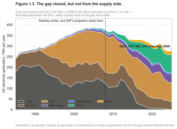
Figure 1.3. Added in the 2026 revision, replacing MacKay’s own version. His was EdF’s projection, and its period is now entirely in the past. The closures happened: coal and nuclear supplied 176 TWh in 2008 and 36 in 2025, and Britain’s last coal station closed in September 2024. The gap did not appear. Wind and solar went from 7 TWh to 105 — but the larger part of the answer is on the other side of the equation, because total generation fell by a quarter, from 374 TWh to 279. More of the gap was closed by using less than by building more, which is this book’s own thesis arriving as an outcome rather than a recommendation.12
What figure 1.3 does not show is what the surviving fleet burns. That is gas, and gas has its own version of figure 1.2a — a shorter one.
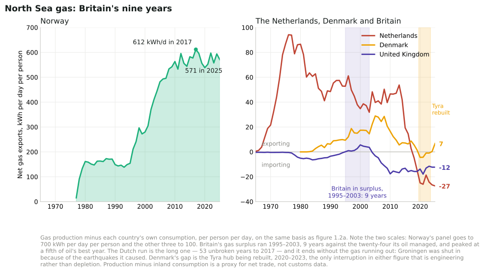
Figure 1.3a. Added in the 2026 revision. The same arithmetic as figure 1.2a, applied to gas. The Netherlands is added because the North Sea’s gas cannot be told without Groningen.13
Britain’s gas surplus lasted nine years. It began in 1995, peaked in 2000 at 5.6 kWh per day per person, and ended in 2004; the country went from importer to exporter and back inside a decade, and even at its best it was exporting about a fifth of what its oil managed in oil’s own best year. In 2025 it imported a net 12 kWh/d per person of gas on top of 15 of oil.
That is worth putting beside figure 1.3. The gap in British generation did not appear, and the largest reason was that demand fell — but the plant still running is largely gas-fired, and the gas is now mostly somebody else’s. Self-sufficiency in the fuel that keeps the lights on was not an era. It was an episode, and a brief one.
The other three lines each end differently, which is the argument for drawing all four. Norway’s is the familiar one, and it never crosses zero: it peaked at 612 kWh per day per person in 2017, has wandered up and down since without trend, and was 571 in 2025. It is now the largest single supplier of the gas the rest of this list imports. Denmark’s dips below zero for four years and comes back — not depletion but the rebuilding of the Tyra hub, and the only interruption in either of these figures that is engineering rather than geology.
And the Netherlands has the longest run of all: a surplus unbroken for the whole fifty-three years the series covers, 1965 to 2017, peaking at 94 kWh per day per person in 1976. It ends in 2017, and it does not end because the gas ran out. Groningen was the largest gas field in Europe and still held a great deal when extraction was wound down, because the earthquakes it caused had been shaking houses in the province apart for years. A country chose to stop. That is the one case in these two figures where the line comes down for a reason the geology had no say in, and it is a useful corrective to reading either chart as a story about resources alone.
Why are we discussing energy policy?
Three different motivations drive today’s energy discussions.
First, fossil fuels are a finite resource. It seems possible that cheap oil (on which our cars and lorries run) and cheap gas (with which we heat many of our buildings) will run out in our lifetime. So we seek alternative energy sources. Indeed given that fossil fuels are a valuable resource, useful for manufacture of plastics and all sorts of other creative stuff, perhaps we should save them for better uses than simply setting fire to them.
Second, we’re interested in security of energy supply. Even if fossil fuels are still available somewhere in the world, perhaps we don’t want to depend on them if that would make our economy vulnerable to the whims of untrustworthy foreigners. (I hope you can hear my tongue in my cheek.) Going by figure 1.2, it certainly looks as if “our” fossil fuels have peaked. The UK has a particular security-of-supply problem looming, known as the “energy gap.” A substantial number of old coal power stations and nuclear power stations will be closing down during the next decade (figure 1.3), so there is a risk that electricity demand will sometimes exceed electricity supply, if adequate plans are not implemented. [2026 revision: figure 1.3 now runs from 1985 to 2025, so it shows what that decade did rather than the projection MacKay had.]
Third, it’s very probable that using fossil fuels changes the climate. Climate change is blamed on several human activities, but the biggest contributor to climate change is the increase in greenhouse effect produced by carbon dioxide (CO2). Most of the carbon dioxide emissions come from fossil-fuel burning. And the main reason we burn fossil fuels is for energy. So to fix climate change, we need to sort out a new way of getting energy. The climate problem is mostly an energy problem.
Whichever of these three concerns motivates you, we need energy numbers, and policies that add up.
The first two concerns are straightforward selfish motivations for drastically reducing fossil fuel use. The third concern, climate change, is a more altruistic motivation – the brunt of climate change will be borne not by us but by future generations over many hundreds of years. Some people feel that climate change is not their responsibility. They say things like “What’s the point in my doing anything? China’s out of control!” So I’m going to discuss climate change a bit more now, because while writing this book I learned some interesting facts that shed light on these ethical questions. If you have no interest in climate change, feel free to fast-forward to the next section.
Who actually has the oil
A section added in the 2026 revision. MacKay raises security of supply as the second motivation, jokes about “the whims of untrustworthy foreigners”, and then leaves the thread there and turns to climate for the rest of the chapter. It is worth picking up, because the numbers are sharper than the joke and they do not point where the joke does.
Most of the world’s oil is produced by countries that do not hold competitive elections. Set the Energy Institute’s 2025 production figures against V-Dem’s regime classification and the world’s 100.6 million barrels a day divides like this:
| Share of world oil production | Largest producers | |
|---|---|---|
| Closed autocracy | 28% | Saudi Arabia, China, UAE, Kuwait, Qatar |
| Electoral autocracy | 32% | Russia, Iran, Iraq, Kazakhstan |
| Electoral democracy | 38% | United States, Canada, Brazil, Nigeria |
| Liberal democracy | 2.6% | Norway, Australia, Denmark |
Three-fifths of it comes from autocracies, and one fortieth from liberal democracies — of which Norway alone is most.14
Now the part that makes the joke misfire. Take Sweden, a country that buys nearly all its oil and produces none. Of the 18.2 million tonnes of crude it imported in 2024, 57% came from Norway, 13% from the United States, 11% from Britain and 11% from Guyana. Libya at 3.6% and Côte d’Ivoire at 0.4% are the only autocratic suppliers on the list. Four per cent of what Sweden buys comes from autocracies, against sixty per cent of what the world pumps.
A reader could conclude that Sweden has solved the problem. It has not, and the reason is the most important fact in this section: oil is fungible. One barrel substitutes for another, so the price is set on a world market where autocracies hold three-fifths of the volume and almost all of the spare capacity that can move the price deliberately. Sweden pays that price whoever fills its tankers. Buying Norwegian protects against a cargo not arriving; it does not protect against what the cargo costs. Norway itself is the demonstration — a large net exporter whose own consumers paid European prices through 2022 like everybody else.
And there is a second-order lesson in the same figures, for European readers particularly. The share of Sweden’s crude that comes from the European Union is 0.25%, which is Denmark and nothing else. The share that comes from the European Economic Area is 57%. The entire difference is Norway, which is inside the internal market and outside the Union. Whatever European energy security means, in this instance it does not mean the Union.
So MacKay’s second motivation survives, but not in the form he states it. The exposure is not to whose flag is on the ship. It is to a price set by a market whose largest participants are not accountable to anyone who buys from it — and no amount of choosing your supplier changes that, which is why this book keeps returning to using less rather than to sourcing better.
The climate-change motivation
The climate-change motivation is argued in three steps: one: human fossilfuel burning causes carbon dioxide concentrations to rise; two: carbon dioxide is a greenhouse gas; three: increasing the greenhouse effect increases average global temperatures (and has many other effects).
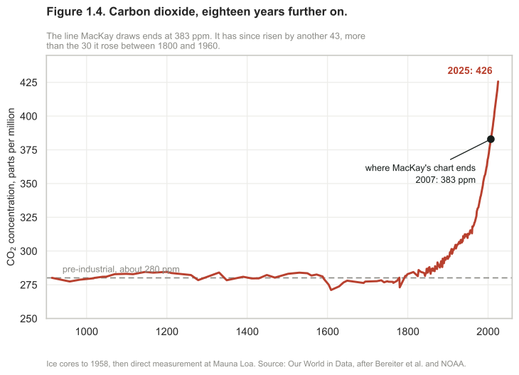
Figure 1.4. Added in the 2026 revision. The same series as MacKay’s figures 1.4 and 1.15, carried to the present. His line ends at 383 ppm in 2007. It reached 426 ppm in 2025 — a rise of 43 in eighteen years, which is more than the 30 ppm it rose in the entire hundred and sixty years between 1800 and 1960. The shape he uses to make the point has not changed; it has only got steeper at the end.15
I think something new may have happened between 1800 AD and 2000 AD. I’ve marked the year 1769, in which James Watt patented his steam engine. (The first practical steam engine was invented 70 years earlier in 1698 16, but Watt’s was much more efficient.) [2026 revision: the replacement figure 1.4 carries no 1769 marker; the upper panel of figure 1.15 still does.] 17
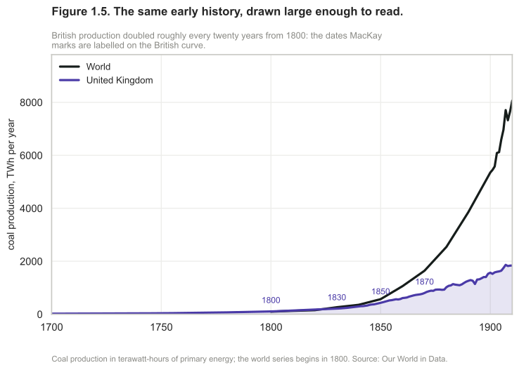
Figure 1.5. Added in the 2026 revision, replacing MacKay’s own version. The same early history, redrawn at a size where the doubling can actually be read. The dates MacKay marks — 1800, 1830, 1850, 1870 — are labelled on the British curve.18
We start with the fact that carbon dioxide concentrations are rising. Figure 1.4 shows measurements of the CO2 concentration in the air from the year 1000AD to the present. Some “sceptics” have asserted that the recent increase in CO2 concentration is a natural phenomenon. Does “sceptic” mean “a person who has not even glanced at the data”? Don’t you think, just possibly, something may have happened between 1800AD and 2000AD? Something that was not part of the natural processes present in the preceding thousand years?
Something did happen, and it was called the Industrial Revolution. I’ve marked on the graph the year 1769, in which James Watt patented his steam engine. While the first practical steam engine was invented in 1698, Watt’s more efficient steam engine really got the Industrial Revolution going. One of the steam engine’s main applications was the pumping of water out of coal mines. Figure 1.5 shows what happened to British coal production from 1769 onwards. The figure displays coal production in units of billions of tons of CO2 released when the coal was burned. [2026 revision: the replacement figure 1.5 draws coal in terawatt-hours a year instead, for the reason given in its note.] In 1800, coal was used to make iron, to make ships, to heat buildings, to power locomotives and other machinery, and of course to power the pumps that enabled still more coal to be scraped up from inside the hills of England and Wales. Britain was terribly well endowed with coal: when the Revolution started, the amount of carbon sitting in coal under Britain was roughly the same as the amount sitting in oil under Saudi Arabia.
In the 30 years from 1769 to 1800, Britain’s annual coal production doubled. After another 30 years (1830), it had doubled again. The next doubling of production-rate happened within 20 years (1850), and another doubling within 20 years of that (1870). This coal allowed Britain to turn the globe pink. The prosperity that came to England and Wales was reflected in a century of unprecedented population growth:
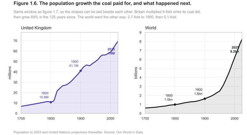
Figure 1.6. Added in the 2026 revision, replacing MacKay’s two population graphs. The growth his text points at, and what followed. Britain multiplied six-fold between 1700 and 1900 while its coal did the same, then grew 69% in the hundred and twenty-five years since. The world went the other way: 2.7-fold to 1900, then 5.1-fold. Drawn on the same window as figure 1.7 so the shapes can be laid beside each other — which is the comparison the surrounding text makes, and it holds in both directions.19
Eventually other countries got in on the act too as the Revolution spread. Figure 1.7 shows British coal production and world coal production on the same scale as figure 1.5, sliding the window of history 50 years later. [2026 revision: the replacement figure 1.7 runs from 1700 to 2025 in thousand terawatt-hours, so neither the shared scale with figure 1.5 nor the 50-year slide survives.] British coal production peaked in 1910, but meanwhile world coal production continued to double every 20 years. It’s difficult to show the history of coal production on a single graph. To show what happened in the next 50 years on the same scale, the book would need to be one metre tall! To cope with this difficulty, we can either scale down the vertical axis:
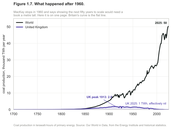
Figure 1.7. Added in the 2026 revision. MacKay stops in 1960 and says that showing the next fifty years on the same scale would need a book a metre tall. Here they are on one page. British coal peaked in 1913 at about 2000 TWh a year and produced 1 TWh in 2025 — not a decline but an ending, and the last deep mine closed in 2015. World production over the same period rose from 9 200 TWh to 50 200, five and a half times, and set its record in the 2020s rather than the 1970s. The shape MacKay describes did not stop; it moved. The doubling he traces through British history is now somebody else’s history, and his own version of this figure is the first half of a picture whose second half is steeper.20
or we can squish the vertical axis in a non-uniform way, so that small quantities and large quantities can be seen at the same time on a single graph. A good way to squish the axis is called a logarithmic scale, and that’s what I’ve used in the bottom two graphs of figure 1.15. On a logarithmic scale, all ten-fold increases (from 1 to 10, from 10 to 100, from 100 to 1000) are represented by equal distances on the page. On a logarithmic scale, a quantity that grows at a constant percentage per year (which is called “exponential growth”) looks like a straight line. Logarithmic graphs are great for understanding growth. Whereas the ordinary graphs in the figures on pages 6 and 7 convey the messages that British and world coal production grew remarkably, and that British and world population grew remarkably, the relative growth rates are not evident in these ordinary graphs. The logarithmic graphs allow us to compare growth rates. Looking at the slopes of the population curves, for example, we can see that the world population’s growth rate in the last 50 years was a little bigger than the growth rate of England and Wales in 1800.
From 1769 to 2006, world annual coal production increased 800-fold. Coal production is still increasing today. Other fossil fuels are being extracted too – the middle graph of figure 1.15 shows oil production for example – but in terms of CO2 emissions, coal is still king.
The burning of fossil fuels is the principal reason why CO2 concentrations have gone up. This is a fact, but, hang on: I hear a persistent buzzing noise coming from a bunch of climate-change inactivists. What are they saying? Here’s Dominic Lawson, a columnist from the Independent:
“The burning of fossil fuels sends about seven gigatons of CO2 per year into the atmosphere, which sounds like a lot. Yet the biosphere and the oceans send about 1900 gigatons and 36000 gigatons of CO2 per year into the atmosphere – … one reason why some of us are sceptical about the emphasis put on the role of human fuel-burning in the greenhouse gas effect. Reducing man-made CO2 emissions is megalomania, exaggerating man’s significance. Politicians can’t change the weather.” 21
Now I have a lot of time for scepticism, and not everything that sceptics say is a crock of manure – but irresponsible journalism like Dominic Lawson’s deserves a good flushing.
The first problem with Lawson’s offering is that all three numbers that he mentions (seven, 1900, and 36000) are wrong! The correct numbers are 26, 440, and 330. Leaving these errors to one side, let’s address Lawson’s main point, the relative smallness of man-made emissions.
Yes, natural flows of CO2 are larger than the additional flow we switched on 200 years ago when we started burning fossil fuels in earnest. But it is terribly misleading to quantify only the large natural flows into the atmosphere, failing to mention the almost exactly equal flows out of the atmosphere back into the biosphere and the oceans. The point is that these natural flows in and out of the atmosphere have been almost exactly in balance for millenia. So it’s not relevant at all that these natural flows are larger than human emissions. The natural flows cancelled themselves out. So the natural flows, large though they were, left the concentration of CO2 in the atmosphere and ocean constant, over the last few thousand years. Burning fossil fuels, in contrast, creates a new flow of carbon that, though small, is not cancelled. Here’s a simple analogy, set in the passport-control arrivals area of an airport.
One thousand passengers arrive per hour, and there are exactly enough clockwork officials to process one thousand passengers per hour. There’s a modest queue, but because of the match of arrival rate to service rate, the queue isn’t getting any longer. Now imagine that owing to fog an extra stream of flights is diverted here from a smaller airport. This stream adds an extra 50 passengers per hour to the arrivals lobby – a small addition compared to the original arrival rate of one thousand per hour. Initially at least, the authorities don’t increase the number of officials, and the officials carry on processing just one thousand passengers per hour. So what happens? Slowly but surely, the queue grows. Burning fossil fuels is undeniably increasing the CO2 concentration in the atmosphere and in the surface oceans. No climate scientist disputes this fact. When it comes to CO2 concentrations, man is significant.

Here’s a portrait of James Watt and his 1769 steam engine.
The middle graph shows (on a logarithmic scale) the history of UK coal production, Saudi oil production, world coal production, world oil production, and (by the top right point) the total of all greenhouse gas emissions in the year 2000. All production rates are expressed in units of the associated CO2 emissions.
The bottom graph shows (on a logarithmic scale) some consequences of the Industrial Revolution: sharp increases in the population of England, and, in due course, the world; and remarkable growth in British pig-iron production (in thousand tons per year); and growth in the tonnage of British ships (in thousand tons).
In contrast to the ordinary graphs on the previous pages, the logarithmic scale allows us to show both the population of England and the population of the World on a single diagram, and to see interesting features in both.
OK. Fossil fuel burning increases CO2 concentrations significantly. But does it matter? “Carbon is nature!”, the oilspinners remind us, “Carbon is life!” If CO2 had no harmful effects, then indeed carbon emissions would not matter. However, carbon dioxide is a greenhouse gas. Not the strongest greenhouse gas, but a significant one nonetheless. Put more of it in the atmosphere, and it does what greenhouse gases do: it absorbs infrared radiation (heat) heading out from the earth and reemits it in a random direction; the effect of this random redirection of the atmospheric heat traffic is to impede the flow of heat from the planet, just like a quilt. So carbon dioxide has a warming effect. 22 This fact is based not on complex historical records of global temperatures but on the simple physical properties of CO2 molecules. Greenhouse gases are a quilt, and CO2 is one layer of the quilt.
So, if humanity succeeds in doubling or tripling CO2 concentrations (which is where we are certainly heading, under business as usual), what happens? Here, there is a lot of uncertainty. Climate science is difficult. The climate is a complex, twitchy beast, and exactly how much warming CO2 -doubling would produce is uncertain. The consensus of the best climate models seems to be that doubling the CO2 concentration would have roughly the same effect as increasing the intensity of the sun by 2%, and would bump up the global mean temperature by something like 3°C. This would be what historians call a Bad Thing. I won’t recite the whole litany of probable drastic effects, as I am sure you’ve heard it before. 23 The litany begins “the Greenland icecap would gradually melt, and, over a period of a few 100 years, sea-level would rise by about 7 metres.” The brunt of the litany falls on future generations. Such temperatures have not been seen on earth for at least 100 000 years, and it’s conceivable that the ecosystem would be so significantly altered that the earth would stop supplying some of the goods and services that we currently take for granted.
Climate modelling is difficult and is dogged by uncertainties. But uncertainty about exactly how the climate will respond to extra greenhouse gases is no justification for inaction. If you were riding a fast-moving motorcycle in fog near a cliff-edge, and you didn’t have a good map of the cliff, would the lack of a map justify not slowing the bike down?
So, who should slow the bike down? Who should clean up carbon emissions? Who is responsible for climate change? This is an ethical question, of course, not a scientific one, but ethical discussions must be founded on facts. Let’s now explore the facts about greenhouse gas emissions. First, a word about the units in which they are measured. Greenhouse gases include carbon dioxide, methane, and nitrous oxide; each gas has different physical properties; it’s conventional to express all gas emissions in “equivalent amounts of carbon dioxide,” where “equivalent” means “having the same warming effect over a period of 100 years.” One ton of carbon-dioxide-equivalent may be abbreviated as “1 t CO2e,” and one billion tons (one thousand million tons) as “1 Gt CO2e” (one gigaton). In this book 1 t means one metric ton (1000 kg). I’m not going to distinguish imperial tons, because they differ by less than 10% from the metric ton or tonne.
In the year 2000, the world’s greenhouse gas emissions were about 34 billion tons of CO2-equivalent per year. An incomprehensible number. But we can render it more comprehensible and more personal by dividing by the number of people on the planet, 6 billion, so as to obtain the greenhouse-gas pollution per person, which is about 5½ tons CO2e per year per person. We can thus represent the world emissions by a rectangle whose width is the population (6 billion) and whose height is the percapita emissions.
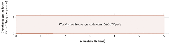
Figure 1.8. The world’s greenhouse gas emissions in the year 2000 as a single rectangle: 34 billion tons of CO2-equivalent, shared equally, is 5½ tons each. Unnumbered in MacKay’s original; numbered here so it can be referred to. Figure 1.12 redraws the construction with current data.
Now, all people are created equal, but we don’t all emit 5½ tons of CO2 per year. We can break down the emissions of the year 2000, showing how the 34-billion-ton rectangle is shared between the regions of the world: 24
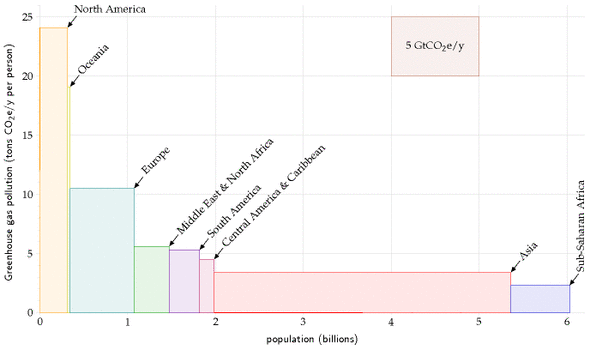
Figure 1.9. The same rectangle divided into eight world regions, on the same scale. Each region’s area is its emissions, the width is its population and the height its emissions per person. In 2000 Europe’s per-capita emissions were twice the world average and North America’s four times it. Unnumbered in MacKay’s original.
This picture, which is on the same scale as the previous one, divides the world into eight regions. Each rectangle’s area represents the greenhouse gas emissions of one region. The width of the rectangle is the population of the region, and the height is the average per-capita emissions in that region.
In the year 2000, Europe’s per-capita greenhouse gas emissions were twice the world average; and North America’s were four times the world average.
We can continue subdividing, splitting each of the regions into countries. This is where it gets really interesting:
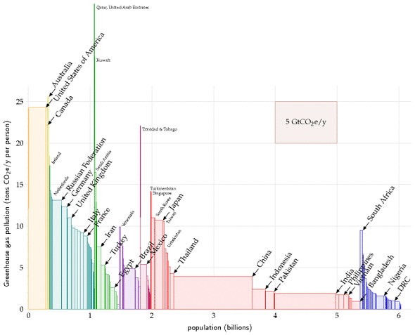
Figure 1.10. The same again, subdivided into countries. The tallest are Australia, the United States and Canada; European countries, Japan and South Africa are the runners up, and the United Kingdom is resolutely average among them. Unnumbered in MacKay’s original. Figure 1.12 shows what this picture looks like in 2023, where the change is China’s height rather than its width.
The major countries with the biggest per-capita emissions are Australia, the USA, and Canada. European countries, Japan, and South Africa are notable runners up. Among European countries, the United Kingdom is resolutely average. What about China, that naughty “out of control” country? Yes, the area of China’s rectangle is about the same as the USA’s, but the fact is that their per-capita emissions are below the world average. India’s per-capita emissions are less than half the world average. Moreover, it’s worth bearing in mind that much of the industrial emissions of China and India are associated with the manufacture of stuff for rich countries.
So, assuming that “something needs to be done” to reduce greenhouse gas emissions, who has a special responsibility to do something? As I said, that’s an ethical question. But I find it hard to imagine any system of ethics that denies that the responsibility falls especially on the countries to the left hand side of this diagram – the countries whose emissions are two, three, or four times the world average. Countries that are most able to pay. Countries like Britain and the USA, for example.
Historical responsibility for climate impact
If we assume that the climate has been damaged by human activity, and that someone needs to fix it, who should pay? Some people say “the polluter should pay.” The preceding pictures showed who’s doing the polluting today. But it isn’t the rate of CO2 pollution that matters, it’s the cumulative total emissions; much of the emitted carbon dioxide (about one third of it) will hang around in the atmosphere for at least 50 or 100 years. If we accept the ethical idea that “the polluter should pay” then we should ask how big is each country’s historical footprint. The next picture shows each country’s cumulative emissions of CO2, expressed as an average emission rate over the period 1880–2004.
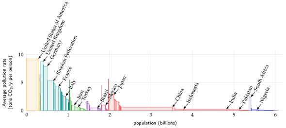
Figure 1.11. Historical emitters per person: cumulative rather than annual emissions, which is the quantity the polluter-pays argument actually needs. Britain is second only to the United States. Unnumbered in MacKay’s original. Figure 1.14 confirms the ranking still holds, and gives the current figures.
Congratulations, Britain! The UK has made it onto the winners’ podium. We may be only an average European country today, but in the table of historical emitters, per capita, we are second only to the USA. 25
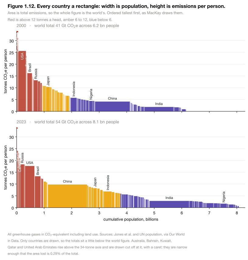
Figure 1.12. Added in the 2026 revision, redrawing MacKay’s construction with current data. The same picture he builds above, for 2000 and for 2023 on one scale. The world total went from 41 to 54 gigatonnes across 6.2 then 8.1 billion people, so the figure got wider and, on average, no shorter: emissions per person are 6.6 tonnes then and 6.7 now.
The change that matters is one rectangle. In 2000 China is the wide, low block MacKay describes — 1.3 billion people at 4.2 tonnes each. By 2023 it is 1.42 billion at 9.8, taller than Japan and half again the height of the European average, and it is the largest single area on the chart. The United States moved the other way, from 25.6 tonnes a head to 17.7, and Europe from 10.5 to 9.0.
MacKay’s question in the text above — “what about China, that naughty out of control country?” — had an answer in 2000 that was about width. It now has an answer about height, and the honest version of his argument has to be made differently as a result. Chapter L separates the four questions this figure runs together; the historical ranking in figure 1.11 above is the one that has moved least, as figure 1.14 confirms.26
Figure 1.13. Added in the 2026 revision. The heights of the previous figure, over time and for any country. This is the movement between its two snapshots, and three crossings are worth finding on it: China passed the world average in 2006, the European Union in 2013 and the United Kingdom in 2014.
The other thing to look for is what the rich lines did. Between 1990 and 2024 the United States fell from 20.3 tonnes a head to 14.2, the United Kingdom from 10.5 to 4.5 and the European Union from 9.2 to 5.4 — each of them roughly halved or better. Over the same period the world average went from 4.3 to 4.7. Every wealthy bloc on the chart came down substantially and the line that matters did not move, because the falls were roughly matched by more people arriving at a middle income. Chapter L pursues that arithmetic; chapter 15 asks how much of the rich-world fall is real and how much is imported goods counted elsewhere.27
Figure 1.14. Added in the 2026 revision. Cumulative carbon dioxide emissions since 1750, from Our World in Data. Because carbon dioxide persists for centuries this is the stock rather than the flow, and it is the chart the historical-responsibility argument actually rests on. The United States has emitted 435 gigatonnes, China 285 and the United Kingdom 80.
But MacKay’s claim above is about a different quantity, and it has survived. He writes that in the table of historical emitters per capita, Britain is second only to the United States. Eighteen years later that is still true: dividing each country’s cumulative emissions by its present population gives the United States 1 259 tonnes a head and the United Kingdom 1 158, with Czechia, Germany and Belgium immediately behind. Of everything in this chapter, the ranking he was pointing at is the one that has moved least — which is what a stock accumulated over two centuries does.28
OK, that’s enough ethics. What do scientists reckon needs to be done, to avoid a risk of giving the earth a 2°C temperature rise (2°C being the rise above which they predict lots of bad consequences)? The consensus is clear. We need to get off our fossil fuel habit, and we need to do so fast. Some countries, including Britain, have committed to at least a 60% reduction in greenhouse-gas emissions by 2050, 29 but it must be emphasized that 60% cuts, radical though they are, are unlikely to cut the mustard. If the world’s emissions were gradually reduced by 60% by 2050, climate scientists reckon it’s more likely than not that global temperatures will rise by more than 2°C. The sort of cuts we need to aim for are shown in figure 1.16. This figure shows two possibly-safe emissions scenarios presented by Baer and Mastrandrea (2006) in a report from the Institute for Public Policy Research. The lower curve assumes that a decline in emissions started in 2007, with total global emissions falling at roughly 5% per year. The upper curve assumes a brief delay in the start of the decline, and a 4% drop per year in global emissions. Both scenarios are believed to offer a modest chance of avoiding a 2°C temperature rise above the pre-industrial level. In the lower scenario, the chance that the temperature rise will exceed 2°C is estimated to be 9–26%. In the upper scenario, the chance of exceeding 2°C is estimated to be 16–43%. These possibly-safe emissions trajectories, by the way, involve significantly sharper reductions in emissions than any of the scenarios presented by the Intergovernmental Panel on Climate Change (IPCC), or by the Stern Review (2007).
These possibly-safe trajectories require global emissions to fall by 70% or 85% by 2050. What would this mean for a country like Britain? If we subscribe to the idea of “contraction and convergence,” which means that all countries aim eventually to have equal per-capita emissions, then Britain needs to aim for cuts greater than 85%: it should get down from its current 11 tons of CO2e per year per person to roughly 1 ton per year per person by 2050. This is such a deep cut, I suggest the best way to think about it is no more fossil fuels.
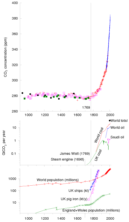
Figure 1.15. The upper graph shows carbon dioxide CO2 concentrations (in parts per million) for the last 1100 years – the same data that was shown in figure 1.4. Retained from MacKay’s original: the two lower panels are the ones his text walks through below, and figure 1.4 replaces only the upper one.
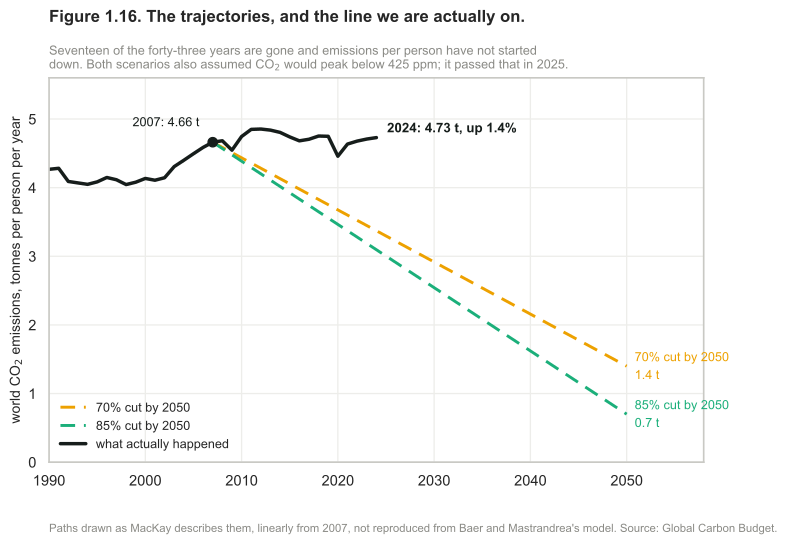
Figure 1.16. Added in the 2026 revision, replacing MacKay’s figure of the same two scenarios. Baer and Mastrandrea’s trajectories, and the line the world is actually on. Seventeen of the forty-three years between 2007 and 2050 have gone, and emissions per person have not started down: 4.66 tonnes in 2007 against 4.73 in 2024, a rise of 1.4%. The scenarios also assumed carbon dioxide would peak at 410 and 425 parts per million respectively. Figure 1.4 shows it passed 425 in 2025, twenty-five years early, so both concentration ceilings are already behind us rather than ahead.3031
One last thing about the climate-change motivation: while a range of human activities cause greenhouse-gas emissions, the biggest cause by far is energy use. Some people justify not doing anything about their energy use by excuses such as “methane from burping cows causes more warming than jet travel.” Yes, agricultural by-products contributed one eighth of greenhouse-gas emissions in the year 2000. But energy-use contributed three quarters (figure 1.17). The climate change problem is principally an energy problem.
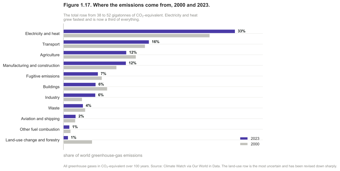
Figure 1.17. Added in the 2026 revision, replacing MacKay’s 2000 breakdown. Where the world’s greenhouse gases come from, then and now. The total rose from 38 to 52 gigatonnes of CO2-equivalent, and the shares moved: electricity and heat from 28% to 33%, so that a third of all emissions now come from making electricity and heat. That is the single most useful number in this chapter for what follows, because it is the part of the problem this book spends most of its length on. Agriculture and waste barely moved. The land-use row fell from 6% to 1%, which is the least trustworthy line on the chart and is discussed in the note.32
Warnings to the reader
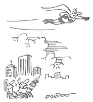
“Look – it’s Low Carbon Emission Man”
Figure 1.18. Reproduced by kind permission of PRIVATE EYE / Peter Dredge www.private-eye.co.uk.
OK, enough about climate change. I’m going to assume we are motivated to get off fossil fuels. Whatever your motivation, the aim of this book is to help you figure out the numbers and do the arithmetic so that you can evaluate policies; and to lay a factual foundation so that you can see which proposals add up. I’m not claiming that the arithmetic and numbers in this book are new; the books I’ve mentioned by Goodstein, Lomborg, and Lovelock, for example, are full of interesting numbers and back-of-envelope calculations, and there are many other helpful sources on the internet too. 33
What I’m aiming to do in this book is to make these numbers simple and memorable; to show you how you can figure out the numbers for yourself; and to make the situation so clear that any thinking reader will be able to draw striking conclusions. I don’t want to feed you my own conclusions. Convictions are stronger if they are self-generated, rather than taught. Understanding is a creative process. When you’ve read this book I hope you’ll have reinforced the confidence that you can figure anything out.
I’d like to emphasize that the calculations we will do are deliberately imprecise. Simplification is a key to understanding. First, by rounding the numbers, we can make them easier to remember. Second, rounded numbers allow quick calculations. For example, in this book, the population of the United Kingdom is 60 million, and the population of the world is 6 billion. I’m perfectly capable of looking up more accurate figures, but accuracy would get in the way of fluent thought. For example, if we learn that the world’s greenhouse gas emissions in 2000 were 34 billion tons of CO2-equivalent per year, then we can instantly note, without a calculator, that the average emissions per person are 5 or 6 tons of CO2-equivalent per person per year. This rough answer is not exact, but it’s accurate enough to inform interesting conversations. For instance, if you learn that a roundtrip intercontinental flight emits nearly two tons of CO2 per passenger, then knowing the average emissions yardstick (5-and-a-bit tons per year per person) helps you realize that just one such plane-trip per year corresponds to over a third of the average person’s carbon emissions.
I like to base my calculations on everyday knowledge rather than on trawling through impersonal national statistics. For example, if I want to estimate the typical wind speeds in Cambridge, I ask “is my cycling speed usually faster than the wind?” The answer is yes. So I can deduce that the wind speed in Cambridge is only rarely faster than my typical cycling speed of 20km/h. I back up these everyday estimates with other peoples’ calculations and with official statistics. (Please look for these in each chapter’s end-notes.) This book isn’t intended to be a definitive store of super-accurate numbers. Rather, it’s intended to illustrate how to use approximate numbers as a part of constructive consensual conversations.
In the calculations, I’ll mainly use the United Kingdom and occasionally Europe, America, or the whole world, but you should find it easy to redo the calculations for whatever country or region you are interested in.
Let me close this chapter with a few more warnings to the reader. Not only will we make a habit of approximating the numbers we calculate; we’ll also neglect all sorts of details that investors, managers, and economists have to attend to, poor folks. If you’re trying to launch a renewable technology, just a 5% increase in costs may make all the difference between success and failure, so in business every detail must be tracked. But 5% is too small for this book’s radar. This is a book about factors of 2 and factors of 10. It’s about physical limits to sustainable energy, not current economic feasibility. While economics is always changing, the fundamental limits won’t ever go away. We need to understand these limits.
Debates about energy policy are often confusing and emotional because people mix together factual assertions and ethical assertions. 34
Examples of factual assertions are “global fossil-fuel burning emits 34 billion tons of carbon dioxide equivalent per year;” and “if CO2 concentrations are doubled then average temperatures will increase by 1.5–5.8°C in the next 100 years;” and “a temperature rise of 2°C would cause the Greenland ice cap to melt within 500 years;” and “the complete melting of the Greenland ice cap would cause a 7-metre sea-level rise.”
A factual assertion is either true or false; figuring out which may be difficult; it is a scientific question. For example, the assertions I just gave are either true or false. But we don’t know whether they are all true. Some of them are currently judged “very likely.” The difficulty of deciding which factual assertions are true leads to debates in the scientific community. But given sufficient scientific experiment and discussion, the truth or falsity of most factual assertions can eventually be resolved, at least “beyond reasonable doubt.”

“Okay – it’s agreed; we announce - ‘to do nothing is not an option!’ then we wait and see how things pan out…”
Figure 1.19. Reproduced by kind permission of PRIVATE EYE / Paul Lowe www.private-eye.co.uk.
Examples of ethical assertions are “it’s wrong to exploit global resources in a way that imposes significant costs on future generations;” and “polluting should not be free;” and “we should take steps to ensure that it’s unlikely that CO2 concentrations will double;” and “politicians should agree a cap on CO2 emissions;” and “countries with the biggest CO2 emissions over the last century have a duty to lead action on climate change;” and “it is fair to share CO2 emission rights equally across the world’s population.” Such assertions are not “either true or false.” Whether we agree with them depends on our ethical judgment, on our values. Ethical assertions may be incompatible with each other; for example, Tony Blair’s government declared a radical policy on CO2 emissions: “the United Kingdom should reduce its CO2 emissions by 60% by 2050;” at the same time Gordon Brown, while Chancellor in that government, repeatedly urged oil-producing countries to increase oil production. 35
This book is emphatically intended to be about facts, not ethics. I want the facts to be clear, so that people can have a meaningful debate about ethical decisions. I want everyone to understand how the facts constrain the options that are open to us. Like a good scientist, I’ll try to keep my views on ethical questions out of the way, though occasionally I’ll blurt something out – please forgive me.
Whether it’s fair for Europe and North America to hog the energy cake is an ethical question; I’m here to remind you of the fact that we can’t have our cake and eat it too; to help you weed out the pointless and ineffective policy proposals; and to help you identify energy policies that are compatible with your personal values.
We need a plan that adds up!
Notes and further reading
At the end of each chapter I note details of ideas in that chapter, sources of data and quotes, and pointers to further information.

The weights of an atom of carbon and a molecule of CO2 are in the ratio 12 to 44, because the carbon atom weighs 12 units and the two oxygen atoms weigh 16 each. 12 + 16 + 16 = 44.
Incidentally, the observed rise in CO2 concentration is nicely in line with what you’d expect, assuming most of the human emissions of carbon remained in the atmosphere. From 1715 to 2004, roughly 1160 GtCO2 have been released to the atmosphere from the consumption of fossil fuels and cement production (Marland et al., 2007). If all of this CO2 had stayed in the atmosphere, the concentration would have risen by 160ppm (from 280 to 440 ppm). The actual rise has been about 100ppm (from 275 to 377ppm). So roughly 60% of what was emitted is now in the atmosphere.
“…no other possible way of doing that except through renewables”; “anybody who is relying upon renewables to fill the [energy] gap is living in an utter dream world and is, in my view, an enemy of the people.” The quotes are from Any Questions?, 27 January 2006, BBC Radio 4 [ydoobr]. Michael Meacher was UK environment minister from 1997 till 2003. Sir Bernard Ingham was an aide to Margaret Thatcher when she was prime minister, and was Head of the Government Information Service. He is secretary of Supporters of Nuclear Energy.↩︎
Jonathon Porritt (March 2006). Is nuclear the answer? Section 3. Advice to Ministers. www.sd-commission.org.uk↩︎
“Nuclear is a money pit”, “We have a huge amount of wave and wind.” Ann Leslie, journalist. Speaking on Any Questions?, Radio 4, 10 February 2006.↩︎
Los Angeles residents drive … from Earth to Mars – (The Earthworks Group, 1989, page 34).↩︎
targetneutral.com charges just £4 per ton of CO2 for their “neutralization.” (A significantly lower price than any other “offsetting” company I have come across.) At this price, a typical Brit could have his 11 tons per year “neutralized” for just £44 per year! Evidence that BP’s “neutralization” schemes don’t really add up comes from the fact that its projects have not achieved the Gold Standard www.cdmgoldstandard.org (Michael Schlup, personal communication). Many “carbon offset” projects have been exposed as worthless by Fiona Harvey of the Financial Times [2jhve6].↩︎
People who want to promote renewables over nuclear, for example, say “offshore wind power could power all UK homes.” At the end of 2007, the UK government announced that they would allow the building of offshore wind turbines “enough to power all UK homes.” Friends of the Earth’s renewable energy campaigner, Nick Rau, said the group welcomed the government’s announcement. “The potential power that could be generated by this industry is enormous,” he said. [25e59w]. From the Guardian [5o7mxk]: John Sauven, the executive director of Greenpeace, said that the plans amounted to a “wind energy revolution.” “And Labour needs to drop its obsession with nuclear power, which could only ever reduce emissions by about 4% at some time in the distant future.” Nick Rau said: “We are delighted the government is getting serious about the potential for offshore wind, which could generate 25% of the UK’s electricity by 2020.” A few weeks later, the government announced that it would permit new nuclear stations to be built. “Today’s decision to give the go-ahead to a new generation of nuclear power stations … will do little to tackle climate change,” Friends of the Earth warned [5c4olc]. In fact, the two proposed expansions – of offshore wind and of nuclear – would both deliver just the same amount of electricity per year. The total permitted offshore wind power of 33 GW would on average deliver 10 GW, which is 4 kWh per day per person; and the replacement of all the retiring nuclear power stations would deliver 10 GW, which is 4 kWh per day per person. Yet in the same breath, anti-nuclear campaigners say that the nuclear option would “do little,” while the wind option would “power all UK homes.” The fact is, “powering all UK homes” and “only reducing emissions by about 4%” are the same thing.↩︎
“water-powered car” New Scientist, 29th July 2006, p.35. This article, headlined “Water-powered car might be available by 2009,” opened thus: “Forget cars fuelled by alcohol and vegetable oil. Before long, you might be able to run your car with nothing more than water in its fuel tank. It would be the ultimate zero-emissions vehicle.”While water is not at first sight an obvious power source, it has a key virtue: it is an abundant source of hydrogen, the element widely touted as the green fuel of the future.” The work New Scientist was describing was not ridiculous – it was actually about a car using boron as a fuel, with a boron/water reaction as one of the first chemical steps. Why did New Scientist feel the urge to turn this into a story suggesting that water was the fuel? Water is not a fuel. It never has been, and it never will be. It is already burned! The first law of thermodynamics says you can’t get energy for nothing; you can only convert energy from one form to another. The energy in any engine must come from somewhere. Fox News peddled an even more absurd story [2fztd3].↩︎
Climate change is a far greater threat to the world than international terrorism. Sir David King, Chief Scientific Advisor to the UK government, January, 2004. [26e8z]↩︎
the glorification of travel – an allusion to the offence of “glorification” defined in the UK’s Terrorism Act which came into force on 13 April, 2006. [ykhayj]↩︎
North Sea production is the sum of the United Kingdom, Norway and Denmark from the Energy Institute’s Statistical Review of World Energy, in thousand barrels daily; the Review reports national totals rather than a North Sea aggregate, and for these three countries national production is overwhelmingly offshore, so the sum is a close proxy rather than the basin itself. The Netherlands is excluded, being mostly gas. Prices are the same source’s crude series in constant 2025 dollars, so the axis is not comparable with MacKay’s 2006 dollars without adjustment; the shape is what should be compared. The figure is generated by
figures/north_sea_oil.pyfromdata-refresh/north-sea-oil.csv. One trap is worth recording for anyone rebuilding it: the Review’s production sheet carries three columns labelled 2025 — the level first, then a growth rate and a share — so a script that takes the last match rather than the first reads a percentage as a production figure and reports the North Sea as having stopped entirely.↩︎Figure 1.2a is computed from the Energy Institute’s Statistical Review of World Energy as republished by Our World in Data, which is the same source as figure 1.2 but its energy series rather than its barrel series, joined to United Nations population estimates and projections. Three cautions. The quantity is production minus each country’s own inland consumption, which is a proxy for net trade rather than customs data: Britain in particular exports its own light North Sea crude and imports heavier grades for its refineries, so its gross flows are a good deal larger than the net line drawn here. The levels cannot be read off figure 1.2, because barrels and energy do not convert at a single factor — the barrel counts include natural-gas liquids, which carry less energy per barrel than crude — and the data task checks the two agree on what they should agree on, which is the shape: both put the North Sea’s peak in 2000. And all three countries were oil importers before their own fields came in, so each surplus has a beginning as well as an end; the task checks that each is a single unbroken run rather than a line flickering across zero, which is what lets the dates above be stated as dates. Population after 2023 is the United Nations’ medium projection.↩︎
Generation rather than capacity, which is a different quantity from the one MacKay’s own version plotted, and is stated on the figure itself: capacity by plant type is not published as a clean annual series over this period, and generation answers the question the figure asks — whether the lights went out — at least as directly. Figures are from the Energy Institute’s Statistical Review via
data-refresh/uk-electricity-mix.csv. The 2008 total is 374 TWh and the 2025 total 279. Note that a fall in generation is not by itself a fall in energy service: some of it is efficiency, some is warmer weather, and some is industry that closed or moved, which chapter 15 counts on the consumption side and finds does not disappear from the world’s emissions. The figure is generated byfigures/uk_gap.py.↩︎Figure 1.3a is computed exactly as figure 1.2a — production minus inland consumption per person, from the Energy Institute’s energy series as republished by Our World in Data, with United Nations population — and carries the same three cautions: it is a proxy for net trade rather than customs data, it is energy rather than volumes, and population after 2023 is the medium projection. Two things specific to this figure. Denmark’s surplus is the one series in either figure that is not a single unbroken run: it is interrupted in 2020, 2021, 2022 and 2023 while the Tyra hub was rebuilt, and the data task checks those four years specifically, so a refresh that turned the interruption into an ending would fail rather than leave the paragraph above in print. And the comparison the section leans on — nine years of gas surplus against twenty-four of oil — is checked across the two figures: the task reads figure 1.2a’s own committed table and fails if it no longer gives Britain twenty-four. Three of the four series also begin after their surplus did — the joined data starts in 1965 for the Netherlands and Britain, 1977 for Norway and 1980 for Denmark, while Groningen was already producing in 1963 — so a run described as unbroken here is unbroken over the years the series covers rather than over the whole life of the field. Britain’s gas import dependence is the net figure; its gross trade is larger in both directions, since it imports by pipeline from Norway and as liquefied gas by sea while still exporting to the continent through the interconnectors.↩︎
Production is the Energy Institute’s Statistical Review of World Energy 2026, oil production in thousand barrels daily for 2025; the four regime classes are V-Dem’s Regimes of the World for 2025, distributed by Our World in Data, where 0 is a closed autocracy, 1 an electoral autocracy, 2 an electoral democracy and 3 a liberal democracy. Joining the two is this edition’s arithmetic and the joint is where the uncertainty lives. Matched countries cover 99 400 of the Statistical Review’s 100 590 thousand barrels daily; the 1.2% difference is regional residuals the Review does not attribute to a country, and Brunei did not match. One coding dominates the table: the United States is 21% of world production and V-Dem classes it as an electoral democracy rather than a liberal one, so counting it as liberal would take the bottom row from 2.6% to 24%. Mexico as an electoral autocracy is likewise contestable. Freedom House and the Economist Intelligence Unit draw the lines elsewhere and would give different totals — there is no neutral answer here, only an answer per classification, which is the same caution chapter L attaches to emissions boundaries. Swedish import figures are Eurostat’s
nrg_ti_oil, crude oil by partner country, 2024, the latest year available: 18 165 thousand tonnes, of which Norway 10 331, the United States 2 311, the United Kingdom 1 966, Guyana 1 942, Nigeria 810, Libya 652, Côte d’Ivoire 67 and Denmark 46. Partner country in trade statistics is the counterparty, not necessarily where the oil was lifted.↩︎Ice-core measurements to 1958 and direct measurement at Mauna Loa after it, in one series from Our World in Data after Bereiter and colleagues and NOAA. The pre-industrial line on the figure is the mean to 1750. The 2007 value is where MacKay’s own chart ends, so the comparison is with his last point rather than with his publication date. Generated by
figures/co2_concentration.pyfromdata-refresh/co2-concentration.csv.↩︎The first practical steam engine was invented in 1698. In fact, Hero of Alexandria described a steam engine, but given that Hero’s engine didn’t catch on in the following 1600 years, I deem Savery’s 1698 invention the first practical steam engine.↩︎
Figures 1.4 and 1.15: Graph of carbon dioxide concentration. The data are collated from Keeling and Whorf (2005) (measurements spanning 1958–2004); Neftel et al. (1994) (1734–1983); Etheridge et al. (1998) (1000–1978); Siegenthaler et al. (2005) (950–1888 AD); and Indermuhle et al. (1999) (from 11000 to 450 years before present). This graph, by the way, should not be confused with the “hockey stick graph”, which shows the history of global temperatures. Attentive readers will have noticed that the climate-change argument I presented makes no mention of historical temperatures. Figures 1.5, 1.7 and 1.15: Coal production numbers are from Jevons (1866), Malanima (2006), Netherlands Environmental Assessment Agency (2006), National Bureau of Economic Research (2001), Hatcher (1993), Flinn and Stoker (1984), Church et al. (1986), Supple (1987), Ashworth and Pegg (1986). Jevons was the first “Peak Oil” author. In 1865, he estimated Britain’s easily-accessible coal reserves, looked at the history of exponential growth in consumption, and predicted the end of the exponential growth and the end of the British dominance of world industry. “We cannot long maintain our present rate of increase of consumption. … the check to our progress must become perceptible within a century from the present time. … the conclusion is inevitable, that our present happy progressive condition is a thing of limited duration.” Jevons was right. Within a century British coal production indeed peaked, and there were two world wars.↩︎
Same source as figure 1.7, drawn in TWh a year rather than thousand TWh. The world series is reported decade by decade before 1900 while the British one is annual, so the two lines are drawn over their own observations rather than interpolated onto a common grid; the British series begins in 1700 and the world one in 1800, which is why the first century carries one line. Generated by
figures/coal_early.py.↩︎Population to 2023 and United Nations projections thereafter, from Our World in Data’s long-run series. MacKay’s two graphs are of England and Wales and of the world; this one uses the United Kingdom, because that is the series available on a consistent basis back to 1700 and it is the unit the rest of this chapter uses. The difference matters for the level and not for the shape: England and Wales are about 89% of the United Kingdom today and were a smaller share in 1700. Generated by
figures/population_longrun.pyfromdata-refresh/population-longrun.csv.↩︎Coal production in terawatt-hours of primary energy from Our World in Data’s long-run series, which splices the Energy Institute’s Statistical Review onto historical statistics; the world series begins in 1800 and the British one in 1700, which is why the first century of the figure carries one line. MacKay dates the British peak to 1910 and this series to 1913; both are right within the precision of century-old production statistics, and nothing in the argument turns on which. Energy units rather than tonnes are used because coal quality varies enormously across three centuries — 2000 TWh is roughly 250 million tonnes of the coal Britain was mining in 1913. The figure is generated by
figures/coal_long_run.pyfromdata-refresh/coal-long-run.csv.↩︎Dominic Lawson, a columnist from the Independent. My quote is adapted from Dominic Lawson’s column in the Independent, 8 June, 2007. It is not a verbatim quote: I edited his words to make them briefer but took care not to correct any of his errors. All three numbers he mentions are incorrect. Here’s how he screwed up. First, he says “carbon dioxide” but gives numbers for carbon: the burning of fossil fuels sends 26 gigatonnes of CO2 per year into the atmosphere (not 7 gigatonnes). A common mistake. Second, he claims that the oceans send 36000 gigatonnes of carbon per year into the atmosphere. This is a far worse error: 36000 gigatonnes is the total amount of carbon in the ocean! The annual flow is much smaller – about 90 gigatonnes of carbon per year (330 GtCO2/y), according to standard diagrams of the carbon cycle [l6y5g] (I believe this 90 GtC/y is the estimated flow rate, were the atmosphere suddenly to have its CO2 concentration reduced to zero.) Similarly his “1900 gigatonne” flow from biosphere to atmosphere is wrong. The correct figure according to the standard diagrams is about 120 gigatonnes of carbon per year (440 Gt CO2/y).↩︎
Carbon dioxide has a warming effect. The over-emotional debate about this topic is getting quite tiresome, isn’t it? “The science is now settled.” “No it isn’t!” “Yes it is!” I think the most helpful thing I can do here is direct anyone who wants a break from the shouting to a brief report written by Charney et al. (1979). This report’s conclusions carry weight because the National Academy of Sciences (the US equivalent of the Royal Society) commissioned the report and selected its authors on the basis of their expertise, “and with regard for appropriate balance.” The study group was convened “under the auspices of the Climate Research Board of the National Research Council to assess the scientific basis for projection of possible future climatic changes resulting from man-made releases of carbon dioxide into the atmosphere.” Specifically, they were asked: “to identify the principal premises on which our current understanding of the question is based, to assess quantitatively the adequacy and uncertainty of our knowledge of these factors and processes, and to summarize in concise and objective terms our best present understanding of the carbon dioxide/climate issue for the benefit of policy-makers.” The report is just 33 pages long, it is free to download [5qfkaw], and I recommend it. It makes clear which bits of the science were already settled in 1979, and which bits still had uncertainty. Here are the main points I picked up from this report. First, doubling the atmospheric CO2 concentration would change the net heating of the troposphere, oceans, and land by an average power per unit area of roughly 4 W/m2, if all other properties of the atmosphere remained unchanged. This heating effect can be compared with the average power absorbed by the atmosphere, land, and oceans, which is 238 W/m2. So doubling CO2 concentrations would have a warming effect equivalent to increasing the intensity of the sun by 4/238 = 1.7%. Second, the consequences of this CO2-induced heating are hard to predict, on account of the complexity of the atmosphere/ocean system, but the authors predicted a global surface warming of between 2°C and 3.5°C, with greater increases at high latitudes. Finally, the authors summarize: “we have tried but have been unable to find any overlooked or underestimated physical effects that could reduce the currently estimated global warmings due to a doubling of atmospheric CO2 to negligible proportions or reverse them altogether.” They warn that, thanks to the ocean, “the great and ponderous flywheel of the global climate system,” it is quite possible that the warming would occur sufficiently sluggishly that it would be difficult to detect in the coming decades. Nevertheless “warming will eventually occur, and the associated regional climatic changes … may well be significant.” The foreword by the chairman of the Climate Research Board, Verner E. Suomi, summarizes the conclusions with a famous cascade of double negatives. “If carbon dioxide continues to increase, the study group finds no reason to doubt that climate changes will result and no reason to believe that these changes will be negligible.”↩︎
The litany of probable drastic effects of climate change – I’m sure you’ve heard it before. See [2z2xg7] if not.↩︎
Breakdown of world greenhouse gas emissions by region and by country. Data source: Climate Analysis Indicators Tool (CAIT) Version 4.0. (Washington, DC: World Resources Institute, 2007). The first three figures show national totals of all six major greenhouse gases (CO2, CH4, N2O, PFC, HFC, SF6), excluding contributions from land-use change and forestry. The following figure shows cumulative emissions of CO2 only.↩︎
Congratulations, Britain! …in the table of historical emissions, per capita, we are second only to the USA. Sincere apologies here to Luxembourg, whose historical per-capita emissions actually exceed those of America and Britain; but I felt the winners’ podium should really be reserved for countries having both large per-capita and large total emissions. In total terms the biggest historical emitters are, in order, USA (322 GtCO2), Russian Federation (90 GtCO2), China (89 GtCO2), Germany (78 GtCO2), UK (62 GtCO2), Japan (43 GtCO2), France (30 GtCO2), India (25 GtCO2), and Canada (24 GtCO2). The per-capita order is: Luxembourg, USA, United Kingdom, Czech Republic, Belgium, Germany, Estonia, Qatar, and Canada.↩︎
All greenhouse gases in CO2-equivalent including land use, per person, from Jones and colleagues, against United Nations population, both via Our World in Data. Only entities with an ISO country code are drawn, so continents, income groups and the world row are excluded and a small residual of territories lacking one of the two series is dropped; that is why each panel’s total sits a little below the published world figure. The land-use component carries the caveat given in the note to figure 1.17. Countries are ordered tallest first, as MacKay orders his, which is why the horizontal axis is cumulative population rather than anything geographic. Generated by
figures/ghg_rectangles.py.↩︎Our World in Data’s chart of territorial CO2 from fossil fuels and industry per person; it is interactive, so any country can be added. Territorial means emissions are counted where they are produced, which is the convention that makes a country’s manufacturing show up in its own total rather than its customers’. The crossing years are read from the same series and are not in the chart’s default selection. The comparison with the European Union uses the 27-member definition throughout, including for years when the Union had different members, which is the series’ own convention rather than a historical statement.↩︎
The embedded chart is Our World in Data’s, showing cumulative territorial CO2 from fossil fuels and industry since 1750; it is interactive, so the countries plotted can be changed. The per-capita figures in the paragraph are this edition’s arithmetic on the same underlying series divided by present population, restricted to countries above three million people so that small states with large per-head totals do not crowd the top; on that basis the United Kingdom ranks second of 138. Note that dividing a two-century stock by today’s population is a convention rather than a measurement — it charges present-day Britons with emissions made by a much smaller population — and a different convention would give a different order. Land-use emissions are excluded throughout, which flatters countries that deforested early, Britain among them.↩︎
Some countries, including Britain, have committed to at least a 60% reduction in greenhouse-gas emissions by 2050. Indeed, as I write, Britain’s commitment is being increased to an 80% reduction relative to 1990 levels.↩︎
Figure 1.16, MacKay’s own note to the scenarios it plots. In the lower scenario, the chance that the temperature rise will exceed 2°C is estimated to be 9–26%; the cumulative carbon emissions from 2007 onwards are 309 GtC; CO2 concentrations reach a peak of 410ppm, CO2e concentrations peak at 421ppm, and in 2100 CO2 concentrations fall back to 355ppm. In the upper scenario, the chance of exceeding 2°C is estimated to be 16–43%; the cumulative carbon emissions from 2007 onwards are 415 GtC; CO2 concentrations reach a peak of 425 ppm, CO2e concentrations peak at 435 ppm, and in 2100 CO2 concentrations fall back to 380 ppm. See also hdr.undp.org/en/reports/global/hdr2007-2008/.↩︎
The two paths are drawn as MacKay describes them — global emissions falling 70% or 85% between 2007 and 2050 — and are straight lines between those endpoints rather than a reproduction of Baer and Mastrandrea’s own model runs, which are not published as a series. The figure says so on its face. Emissions are territorial CO2 per person from the Global Carbon Budget, so they exclude the other greenhouse gases that MacKay’s own scenario figure includes; the comparison is therefore of shape rather than of level, and the 1.4% change since 2007 is the part that does not depend on the choice. The peak-concentration figures of 410 and 425 ppm are MacKay’s own, from his note to the original figure. Generated by
figures/emission_paths.py.↩︎All greenhouse gases in CO2-equivalent over a hundred-year warming potential, from Climate Watch via Our World in Data, which is a different compilation from the EDGAR figures MacKay used, so the 2000 column here is not identical to his. The land-use and forestry row is the most uncertain quantity in the table by a wide margin: it is a net figure combining deforestation against regrowth, it has been revised downwards substantially as the estimates improved, and a fall from 6% to 1% of a growing total should be read as a change in measurement at least as much as a change in the world. Chapter 31 sets out why land-sector accounting is hard and how far the numbers move. Generated by
figures/ghg_sectors.py.↩︎there are many other helpful sources on the internet. I recommend, for example: BP’s Statistical Review of World Energy [yyxq2m], the Sustainable Development Commission www.sd-commission.org.uk, the Danish Wind Industry Association www.windpower.org, Environmentalists For Nuclear Energy www.ecolo.org, Wind Energy Department, Risø University www.risoe.dk/vea, DEFRA www.defra.gov.uk/environment/statistics, especially the book Avoiding Dangerous Climate Change [dzcqq], the Pembina Institute www.pembina.org/publications.asp, and the DTI (now known as BERR) www.dti.gov.uk/publications/.↩︎
factual assertions and ethical assertions… Ethical assertions are also known as “normative claims” or “value judgments,” and factual assertions are known as “positive claims.” Ethical assertions usually contain verbs like “should” and “must,” or adjectives like “fair,” “right,” and “wrong.” For helpful further reading see Dessler and Parson (2006).↩︎
Gordon Brown. On 10th September, 2005, Gordon Brown said the high price of fuel posed a significant risk to the European economy and to global growth, and urged OPEC to raise oil production. Again, six months later, he said “we need … more production, more drilling, more investment, more petrochemical investment” (22nd April, 2006) [y98ys5]. Let me temper this criticism of Gordon Brown by praising one of his more recent initiatives, namely the promotion of electric vehicles and plug-in hybrids. As you’ll see later, one of this book’s conclusions is that electrification of most transport is a good part of a plan for getting off fossil fuels.↩︎