4 Wind
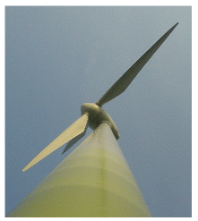
The UK has the best wind resources in Europe.
Sustainable Development Commission
Wind farms will devastate the countryside pointlessly.
James Lovelock
How much wind power could we plausibly generate?
We can make an estimate of the potential of on-shore (land-based) wind in the United Kingdom by multiplying the average power per unit land area of a wind farm by the area per person in the UK:
power per person = wind power per unit area × area per person.
Chapter B explains how to estimate the power per unit area of a wind farm in the UK. If the typical windspeed is 6 m/s (13 miles per hour, or 22 km/h), the power per unit area of wind farm is about 2 W/m2.

Figure 4.1. Cambridge mean wind speed in metres per second, daily (red line), and half-hourly (blue line) during 2006. See also figure 4.6. 1
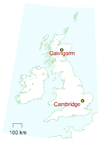
This figure of 6 m/s is probably an over-estimate for many locations in Britain. For example, figure 4.1 shows daily average windspeeds in Cambridge during 2006. The daily average speed reached 6 m/s on only about 30 days of the year – see figure 4.6 for a histogram. But some spots do have windspeeds above 6 m/s – for example, the summit of Cairngorm in Scotland (figure 4.2).
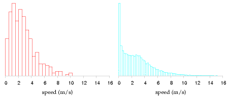
Figure 4.6. Histogram of Cambridge average wind speed in metres per second: daily averages (left), and half-hourly averages (right).
Plugging in the British population density: 250 people per square kilometre, or 4000 square metres per person, we find that wind power could generate
2 W/m2 ×4000 m2/person = 8000 W per person,
if wind turbines were packed across the whole country, and assuming 2 W/m2 is the correct power per unit area. Converting to our favourite power units, that’s 200 kWh/d per person.
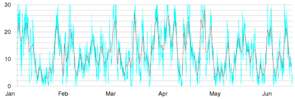
Figure 4.2. Cairngorm mean wind speed in metres per second, during six months of 2006.
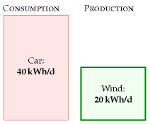
Figure 4.3. Chapter 4’s conclusion: the maximum plausible production from on-shore windmills in the United Kingdom is 20 kWh per day per person.
Let’s be realistic. What fraction of the country can we really imagine covering with windmills? Maybe 10%? Then we conclude: if we covered the windiest 10% of the country with windmills (delivering 2 W/m2), we would be able to generate 20 kWh/d per person, which is half of the power used by driving an average fossil-fuel car 50 km per day.
Britain’s onshore wind energy resource may be “huge,” but it’s evidently not as huge as our huge consumption. We’ll come to offshore wind later.
I should emphasize how generous an assumption I’m making. Let’s compare this estimate of British wind potential with current installed wind power worldwide. The windmills that would be required to provide the UK with 20 kWh/d per person amount to 50 times the entire wind hardware of Denmark; 7 times all the wind farms of Germany; and double the entire fleet of all wind turbines in the world. 2
Please don’t misunderstand me. Am I saying that we shouldn’t bother building wind farms? Not at all. I’m simply trying to convey a helpful fact, namely that if we want wind power to truly make a difference, the wind farms must cover a very large area.
This conclusion – that the maximum contribution of onshore wind, albeit “huge,” is much less than our consumption – is important, so let’s check the key figure, the assumed power per unit area of wind farm (2 W/m2), against a real UK wind farm.
Power per unit area
wind farm (speed 6 m/s)
2 W/m2
Table 4.4. Facts worth remembering: wind farms.
| Population density of Britain |
|---|
| 250 per km2 ↔︎ 4000m2 per person |
Table 4.5. Facts worth remembering: population density. See chapter J for more population densities.
The Whitelee wind farm being built near Glasgow in Scotland has 140 turbines with a combined peak capacity of 322 MW in an area of 55 km2. That’s 6 W/m2, peak. The average power produced is smaller because the turbines don’t run at peak output all the time. The ratio of the average power to the peak power is called the “load factor” or “capacity factor,” and it varies from site to site, and with the choice of hardware plopped on the site; a typical factor for a good site with modern turbines is 30%. If we assume Whitelee has a load factor of 33% then the average power production per unit land area is 2 W/m2 – exactly the same as the power density we assumed above.
The turbines got bigger. The answer did not.
A section added in the 2026 revision. Britain has moved offshore and upward since this chapter was written, and the scale of the change invites the assumption that the arithmetic above must be obsolete. It is not, and the reason is worth following.
MacKay’s typical machine was a 1 MW turbine with a 54-metre rotor. Dogger Bank, off the Yorkshire coast, is being built with GE Haliade-X units of 13 to 14.7 MW — a 220-metre rotor and a tip height of 260 metres, taller than any building in Britain outside London. Thirteen times the capacity of his reference turbine. Each one produces about 70 GWh a year.
Two things improved enormously and one did not.
Capacity factor improved. This chapter assumes a load factor of 33%. Dogger Bank’s site has been running above 55%, and the turbine is rated for 60–64% in those conditions. Offshore wind at 130 kilometres from land is a different resource from a hill in Scotland, and a machine reaching 260 metres samples a wind that a 1 MW turbine never touched.
Power per unit area did not improve — it fell. Dogger Bank A puts 1235 MW into 515 km2, Dogger Bank B the same into 599 km2, and neighbouring Sofia 1400 MW into 593 km2. Together that is 3870 MW in 1707 km2, or 2.3 W/m2 of peak capacity. At the 55% capacity factor actually achieved, the average is about 1.3 W/m2 — below the 2 W/m2 this chapter assumes for onshore wind, despite far better wind.
Chapter B explains why, and predicted it: power per unit area does not depend on turbine size, because spacing scales with diameter. What has changed is the spacing itself. This chapter assumes turbines 5 diameters apart; Dogger Bank spaces them about 10.6 diameters apart, and density falls with the square of that.
So the central claim of this chapter survives intact. The constraint on wind is area, and bigger turbines have not relaxed it. What Britain gained by going offshore is not a denser resource but a larger and less contested one — sea instead of land, and nobody’s view of it. The 2 W/m2 here remains the right order of magnitude, and for offshore it is if anything generous.
The same rooftop, seventeen years on
Figures 4.1 and 4.6 are one weather station: the Computer Laboratory’s roof, about ten metres up, recorded half-hourly through 2006. The station is still there and still publishing the same file, which makes these two of the few figures in the book that can be carried forward on the same instrument at the same address rather than on a substitute.
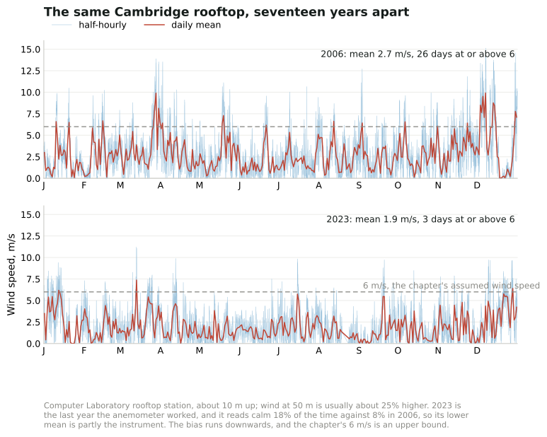
Figure 4.1a. Added in the 2026 revision. The station of MacKay’s figure 4.1 — the Computer Laboratory roof, about 10 m up — in his year and in 2023, the last year its anemometer worked. Half-hourly readings in pale blue, the daily mean in red, and this chapter’s assumed 6 m/s dashed. Wind at 50 m is usually about 25% higher than at this height.3
The recompute finds MacKay’s own result first. On his 2006 data the daily mean reaches 6 m/s on 26 days, where his text says about 30. That agreement is the check that the file is being read the way he read it, because the wind column’s units are not documented anywhere on the site, and at any other scaling his sentence would be nonsense.
Then the update, which arrives with a warning attached. The anemometer has failed: 2024 is 97% zeros and 2025 and 2026 are entirely zeros, while the station’s front page mentions only a power outage in January. The last usable year is 2023. In it the daily mean reached 6 m/s on three days, and the year averaged 1.9 m/s against 2006’s 2.7.
That fall is not a claim about Cambridge’s weather. The same instrument reported dead calm 8% of the time in 2006 and 18% in 2023, which is the signature of an anemometer going stiff rather than of a city falling still. What survives the doubt is the direction, because the bias runs downwards and this chapter’s 6 m/s is an upper bound: in the windier of the two years, read the more generous way, a Cambridge rooftop managed a daily mean of 6 m/s on 26 days out of 363.
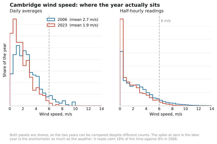
Figure 4.6a. Added in the 2026 revision. The distributions behind figure 4.1a, in the form of MacKay’s figure 4.6: daily averages on the left, half-hourly readings on the right, each as a share of its own year so that the two can be compared. The spike at zero in the later year is the instrument as much as the weather.4
And the histogram makes the point the mean hides, because power goes as the cube of the speed. A year averaging 2.7 m/s is not half a year averaging 5.4. Taking the cube of every half-hourly reading in 2006 and averaging those gives 86 m3/s3; a steady 6 m/s gives 216. The rooftop, in the windier year, saw about 40% of the wind power that this chapter’s 6 m/s assumption implies — which is why the assumption is described here as an over-estimate for many locations, and why the windmills in this book go on hills and out to sea rather than into town.5
MacKay’s other wind figure is the answer to the obvious objection, and it carries forward too. Figure 4.2 is the summit of Cairn Gorm, 1245 metres up, where Heriot-Watt University has run an automatic weather station since 1977 and still does.
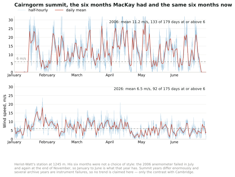
Figure 4.2a. Added in the 2026 revision. The station of MacKay’s figure 4.2, in his six months and in the same six months of 2026, drawn to compare with figure 4.1a. Note the vertical scale: it is twice the Cambridge one.6
His caption says “six months of 2006”, and the archive explains why it says six. That year’s anemometer failed in July and again at the end of November — the station’s own log records “1/12/06 Suspected anemometer fault” — so January to June is what 2006 has. In those six months the daily mean was 11.2 m/s and 133 of 179 days averaged 6 m/s or more. In the same months of 2026 the daily mean was 6.5 m/s, over 92 of 175 days.
No trend should be read into that pair. A summit’s year-to-year variation is large, several years in this archive are instrument failures rather than calm weather — 2012 reads 1.4 m/s for a Scottish winter half-year — and this edition has no way to separate the two. What the panels do show is what the chapter uses them for. Even the quieter of the two half-years averages more than twice what the Cambridge rooftop managed in its windier year, and stays above the 6 m/s this chapter assumes. That is the case for putting windmills on hills rather than in towns, and it has not moved.7
Will the wind still be there?
There is a worry that would undo this chapter quietly if it were true: global stilling, the observed slowing of surface winds since the late twentieth century. Because power goes as the cube of wind speed, even a small decline compounds — one study found a 5.5% per decade fall in wind speed accompanied by a 24.5% per decade fall in power. Chapter B examines how much of the measured decline survives being sampled properly. Two recent results bear on whether Britain should discount its wind resource for it, and both say no, for different reasons.
The first is that the climate signal is small. Giddings and colleagues modelled UK offshore generation to 2050 across an ensemble of climate projections and found the mean annual capacity factor falling by about 2.3% — a summer decline of 3.6% against a winter one of 1.5%.8 They attribute the summer weakening to multi-decadal variability rather than to stilling, and note that year-to-year climate variability is large compared with the whole projected twenty-first-century climate effect. A resource that varies more between two consecutive years than it is expected to shift in thirty is not a resource being taken away.
The second is more useful, because it identifies a lever. The same study compared three ways of distributing 140 GW of offshore capacity by 2050: concentrated on the east coast as now, following the Crown Estate’s proposals, or spread evenly across all sixteen UK shipping zones. Spreading it did not reduce mean generation at all, and it transformed the worst hours: minimum daily generation rose 27.9%, day-to-day variability fell 15.5%, extreme hourly ramps fell 33.5%, and the hours per year spent below 5% of capacity fell by 87%.
That last number deserves its own sentence. The single most quoted objection to wind — that sometimes it simply stops — is reduced roughly eightfold not by building storage or by burning gas, but by not putting all the turbines in the same weather. Capacity factor between zones correlates inversely with distance, so dispersal buys smoothing for free. It is the same insight as chapter 26’s, arrived at geographically rather than through storage.
For this chapter’s arithmetic that means the 2 W/m2 and the wind speed behind it can stand. What changes is the advice that follows from them: the binding question for British wind is no longer how much area is available, nor whether the wind is dying, but how correlated the chosen sites are with each other.
What the wind now earns
There is a second thing this chapter’s method cannot see, and it has become the binding constraint in practice. MacKay counts kilowatt-hours; the market pays for kilowatt-hours at the moment they arrive, and wind arrives when other wind does.
In Great Britain in 2025, against a time-weighted average market price of £79.9/MWh, wind captured £72.0 and solar £65.9 — value factors of 0.90 and 0.82. Gas, which can choose its hours, captured £94.8, a factor of 1.19.9 Every gigawatt of wind added lowers the price in precisely the hours that all the other wind is generating, so the resource this chapter sizes in W/m2 is worth progressively less per unit as it grows. That is a different limit from the one MacKay identified, it binds long before the land runs out, and chapter 28a is about it.
Queries
Wind turbines are getting bigger all the time. Do bigger wind turbines change this chapter’s answer?
Chapter B explains. Bigger wind turbines deliver financial economies of scale, but they don’t greatly increase the total power per unit land area, because bigger windmills have to be spaced further apart. A wind farm that’s twice as tall will deliver roughly 30% more power.
Answered again in the 2026 revision, because half of this has held and half has reversed.
The physical half held exactly, and the section above sets out the evidence: turbines went from 1 MW to nearly 15 MW, and the power per unit area did not rise. If anything it fell, because the spacing widened from the 5 diameters assumed in chapter B to about 10.6 at Dogger Bank.
The financial half — “bigger wind turbines deliver financial economies of scale” — was the reasonable expectation in 2008 and it stopped being true around 2021. Britain runs an auction that measures this cleanly, because the same contract is bid in the same 2012 pounds each round:
| Allocation Round | Offshore wind strike price (2012 £/MWh) | Capacity secured |
|---|---|---|
| AR4, July 2022 | 37.35 | ~7 GW |
| AR5, September 2023 | no bids | 0 |
| AR6, September 2024 | 58.87 | 3.4 GW |
Between AR4 and AR6 the price Britain had to offer for offshore wind rose by 58% in real terms in two years, with an auction in between that attracted no offshore bids at all because the administrative price was set too low to build at. Over precisely that period the turbines being installed got substantially bigger. So the economies of scale were real and were swamped: steel, copper, cables, vessels and above all the cost of capital rose faster than the engineering could compensate.
The AR6 price of £58.87 in 2012 money is about £82/MWh in today’s money, against a GB market price averaging £80/MWh in 2025 — which is to say that new offshore wind now needs roughly the market price to proceed, where in 2022 it was contracting well below it. Chapter 28a takes up what that means, and adds the second half of the squeeze: the same build-out lowers the price it earns.
None of this touches the arithmetic of this chapter, which is about area and wind speed. It bears on a different question — how much of the resource gets built, and at what price — and it is a reminder that the cost of a technology is not a physical constant with a downward slope.10
Wind power fluctuates all the time. Surely that makes wind less useful?
Maybe. We’ll come back to this issue in Chapter 26, where we’ll look at wind’s intermittency and discuss several possible solutions to this problem, including energy storage and demand management.
Mythconceptions
“Wind turbines take up too much land.”
They take up very little land, and the confusion is between spacing and footprint. This chapter’s 2 W/m2 is a figure for the whole wind farm — the land a turbine needs to stand far enough from its neighbour not to steal its wind. The arithmetic of that spacing gives the answer. Turbines are set about five diameters apart, so a 100 m machine occupies a cell of roughly 500 × 500 m, or 250 000 m2. Its foundation and hardstanding are of order 20 × 20 m, and a few hundred metres of access track a few metres wide adds perhaps 2000 m2 more — call it 2500 m2 in total, which is about one per cent of the cell. The other 99% is still farmland, and is generally still farmed.
The correct objection is the one this chapter actually makes, which is not about land use but about area per person: at 2 W/m2, supplying a serious share of British demand requires wind farms covering a country-sized fraction of the country, and that is a planning and landscape argument rather than an agricultural one. Answering the wrong version of the objection is how the right version gets ignored.11
Notes and further reading
Figure 4.1 and figure 4.6. Cambridge wind data are from the Digital Technology Group, Computer Laboratory, Cambridge [vxhhj]. The weather station is on the roof of the Gates building, roughly 10 m high. Wind speeds at a height of 50 m are usually about 25% bigger. Cairngorm data (figure 4.2) are from Heriot–Watt University Physics Department [tdvml].↩︎
The windmills required to provide the UK with 20 kWh/d per person are 50 times the entire wind power of Denmark. Assuming a load factor of 33%, an average power of 20 kWh/d per person requires an installed capacity of 150 GW. At the end of 2006, Denmark had an installed capacity of 3.1 GW; Germany had 20.6 GW. The world total was 74 GW (www.wwindea.org). Incidentally, the load factor of the Danish wind fleet was 22% in 2006, and the average power it delivered was 3 kWh/d per person.↩︎
Figures 4.1a and 4.6a are computed from the Cambridge Computer Laboratory weather station’s own half-hourly file,
weather-raw.csv, which runs from 30 June 1995 to the present — the same station MacKay used, and since 2004 on the same roof. Four things a reader should know. The wind column is in tenths of a knot. That is not stated anywhere on the site; it is inferred here, and the inference is checked against MacKay’s published result, since on this reading 2006 gives 26 days with a daily mean of 6 m/s or more against the “about 30 days” of his text, and no other scaling puts his sentence within reach. The station has moved twice — from the roof of AT&T Laboratories to the Engineering Department in 2002 and to the Computer Laboratory in 2004 — and the annual means step up by about a metre per second at the 2004 move, so only years from 2004 onwards are comparable with his, which is why the second panel is not from the 1990s. The anemometer has since failed: 2024 is 97% zero readings and 2025 and 2026 are 100%, making 2023 the last usable year, and the share of zero readings had already climbed from 8% in 2006 to 18% in 2023, so the later year’s lower mean is partly the instrument. And the station itself says, on its front page, that it is amateur-maintained and that its data should not be used in statistical analysis without cleaning and calibration against other sources. This edition has done no such calibration, which is why the text above leans on the direction of the comparison and on MacKay’s own year, and not on the size of the difference between the two. A daily mean here is the average of a day’s half-hourly readings and is used only where at least 36 of the 48 are present; 2006 has 363 such days and 2023 has 359. The mean of the cube is computed over the half-hourly readings, not from the mean speed.↩︎Figures 4.1a and 4.6a are computed from the Cambridge Computer Laboratory weather station’s own half-hourly file,
weather-raw.csv, which runs from 30 June 1995 to the present — the same station MacKay used, and since 2004 on the same roof. Four things a reader should know. The wind column is in tenths of a knot. That is not stated anywhere on the site; it is inferred here, and the inference is checked against MacKay’s published result, since on this reading 2006 gives 26 days with a daily mean of 6 m/s or more against the “about 30 days” of his text, and no other scaling puts his sentence within reach. The station has moved twice — from the roof of AT&T Laboratories to the Engineering Department in 2002 and to the Computer Laboratory in 2004 — and the annual means step up by about a metre per second at the 2004 move, so only years from 2004 onwards are comparable with his, which is why the second panel is not from the 1990s. The anemometer has since failed: 2024 is 97% zero readings and 2025 and 2026 are 100%, making 2023 the last usable year, and the share of zero readings had already climbed from 8% in 2006 to 18% in 2023, so the later year’s lower mean is partly the instrument. And the station itself says, on its front page, that it is amateur-maintained and that its data should not be used in statistical analysis without cleaning and calibration against other sources. This edition has done no such calibration, which is why the text above leans on the direction of the comparison and on MacKay’s own year, and not on the size of the difference between the two. A daily mean here is the average of a day’s half-hourly readings and is used only where at least 36 of the 48 are present; 2006 has 363 such days and 2023 has 359. The mean of the cube is computed over the half-hourly readings, not from the mean speed.↩︎Figures 4.1a and 4.6a are computed from the Cambridge Computer Laboratory weather station’s own half-hourly file,
weather-raw.csv, which runs from 30 June 1995 to the present — the same station MacKay used, and since 2004 on the same roof. Four things a reader should know. The wind column is in tenths of a knot. That is not stated anywhere on the site; it is inferred here, and the inference is checked against MacKay’s published result, since on this reading 2006 gives 26 days with a daily mean of 6 m/s or more against the “about 30 days” of his text, and no other scaling puts his sentence within reach. The station has moved twice — from the roof of AT&T Laboratories to the Engineering Department in 2002 and to the Computer Laboratory in 2004 — and the annual means step up by about a metre per second at the 2004 move, so only years from 2004 onwards are comparable with his, which is why the second panel is not from the 1990s. The anemometer has since failed: 2024 is 97% zero readings and 2025 and 2026 are 100%, making 2023 the last usable year, and the share of zero readings had already climbed from 8% in 2006 to 18% in 2023, so the later year’s lower mean is partly the instrument. And the station itself says, on its front page, that it is amateur-maintained and that its data should not be used in statistical analysis without cleaning and calibration against other sources. This edition has done no such calibration, which is why the text above leans on the direction of the comparison and on MacKay’s own year, and not on the size of the difference between the two. A daily mean here is the average of a day’s half-hourly readings and is used only where at least 36 of the 48 are present; 2006 has 363 such days and 2023 has 359. The mean of the cube is computed over the half-hourly readings, not from the mean speed.↩︎Figure 4.2a is computed from the Cairngorm Automatic Weather Station’s own archive, run by Heriot-Watt University’s physics department at 1245 m, which asks only that it be cited as the source. Mean wind speed is the station’s own 2.5-minute mean of readings taken every 2.5 seconds, reported every half hour, in miles per hour since 1996 and converted here. The archive names its files inconsistently — YEARDATA2006.txt one year, YearData.txt another, “2010 Data.txt” a third — so the data task reads each year’s page for its own link, and the 2006 file is tab-separated with a leading date while the current year’s is comma-separated without one. Readings above 120 mph or below zero are dropped as sensor errors, which is what the archive’s 6999 values are. The two half-years plotted are January to June because that is what 2006 has: the notes on the station’s own 2006 page and its log record an anemometer failure over the summer and another at the end of November. The current year’s file runs to 31 August 2026 and the station’s front page was last updated that day, so 2026 here means the first eight months of it, of which the first six are plotted. This edition tried and abandoned a comparison across all the archive’s years: 2012 gives 1.4 m/s and 2016 3.9 m/s for a Cairngorm January-to-June, which are failures rather than weather, and no quality-controlled series is published that would let them be told apart. The contrast the text draws with Cambridge is a factor of four and survives any of that.↩︎
Figure 4.2a is computed from the Cairngorm Automatic Weather Station’s own archive, run by Heriot-Watt University’s physics department at 1245 m, which asks only that it be cited as the source. Mean wind speed is the station’s own 2.5-minute mean of readings taken every 2.5 seconds, reported every half hour, in miles per hour since 1996 and converted here. The archive names its files inconsistently — YEARDATA2006.txt one year, YearData.txt another, “2010 Data.txt” a third — so the data task reads each year’s page for its own link, and the 2006 file is tab-separated with a leading date while the current year’s is comma-separated without one. Readings above 120 mph or below zero are dropped as sensor errors, which is what the archive’s 6999 values are. The two half-years plotted are January to June because that is what 2006 has: the notes on the station’s own 2006 page and its log record an anemometer failure over the summer and another at the end of November. The current year’s file runs to 31 August 2026 and the station’s front page was last updated that day, so 2026 here means the first eight months of it, of which the first six are plotted. This edition tried and abandoned a comparison across all the archive’s years: 2012 gives 1.4 m/s and 2016 3.9 m/s for a Cairngorm January-to-June, which are failures rather than weather, and no quality-controlled series is published that would let them be told apart. The contrast the text draws with Cambridge is a factor of four and survives any of that.↩︎
Josh Giddings, Hannah Bloomfield, Rachel James and Michael Blair, “The impact of future UK offshore wind farm distribution and climate change on generation performance and variability”, Environmental Research Letters, 2024, https://doi.org/10.1088/1748-9326/ad489b. Their ERA5-derived historical mean annual capacity factor is 48.3%, or 45.4% once wake losses and curtailment are allowed for, against an observed 45.7% for 2020 — a useful check on the 33% load factor assumed elsewhere in this chapter. The 5.5%/24.5% per decade comparison in the paragraph above is cited in Vest and Tych, discussed in chapter B.↩︎
GB capture prices for 2025, computed from Elexon BMRS half-hourly generation by fuel type and the market index price (APXMIDP), in this edition’s data pipeline. Capture price is generation-weighted revenue per MWh; the value factor is that divided by the time-weighted system average of £79.9/MWh.↩︎
Contracts for Difference allocation round results, DESNZ. AR4 cleared offshore wind at £37.35/MWh in 2012 prices across roughly 7 GW; AR5 in September 2023 received no offshore wind bids; AR6 in September 2024 cleared at £58.87/MWh in 2012 prices for 3.37 GW of new offshore capacity, with permitted-reduction projects at £54.23. CPI-indexed, £58.87 in 2012 money is about £82/MWh in 2024 money. The GB time-weighted average market price for 2025 was £79.9/MWh, computed from Elexon data in this edition’s pipeline.↩︎
The claim is one of the energy- and economics-related entries in the Skeptical Science catalogue of climate arguments, https://skepticalscience.com/argument.php. The answer given here is this book’s own, worked from the arithmetic in this chapter rather than restated from that source; the reference is included because the catalogue is the most complete list of what is actually argued, and because a reader meeting one of these claims deserves somewhere to go that is not this book. Chapter 31 explains why most of that catalogue is not this book’s argument, and carries the counts.↩︎